Positioning a Local Product for the African Climate.
Branding
Logo design
Strategy
Challenge: A paint company needs to prove it can survive the Nigerian sun and rain. The identity needed to feel "Majestic" (as the name implies) but also "Resilient."
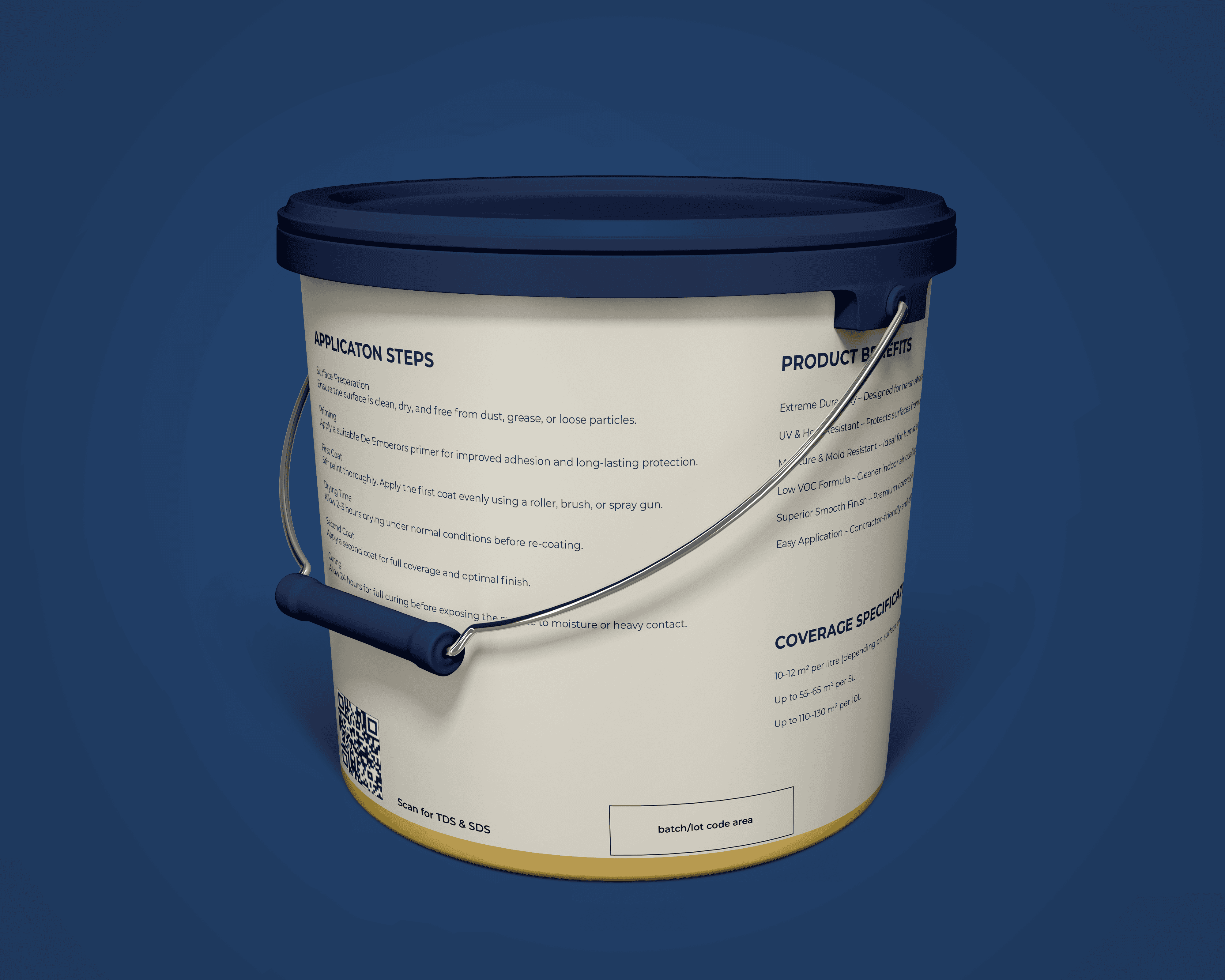
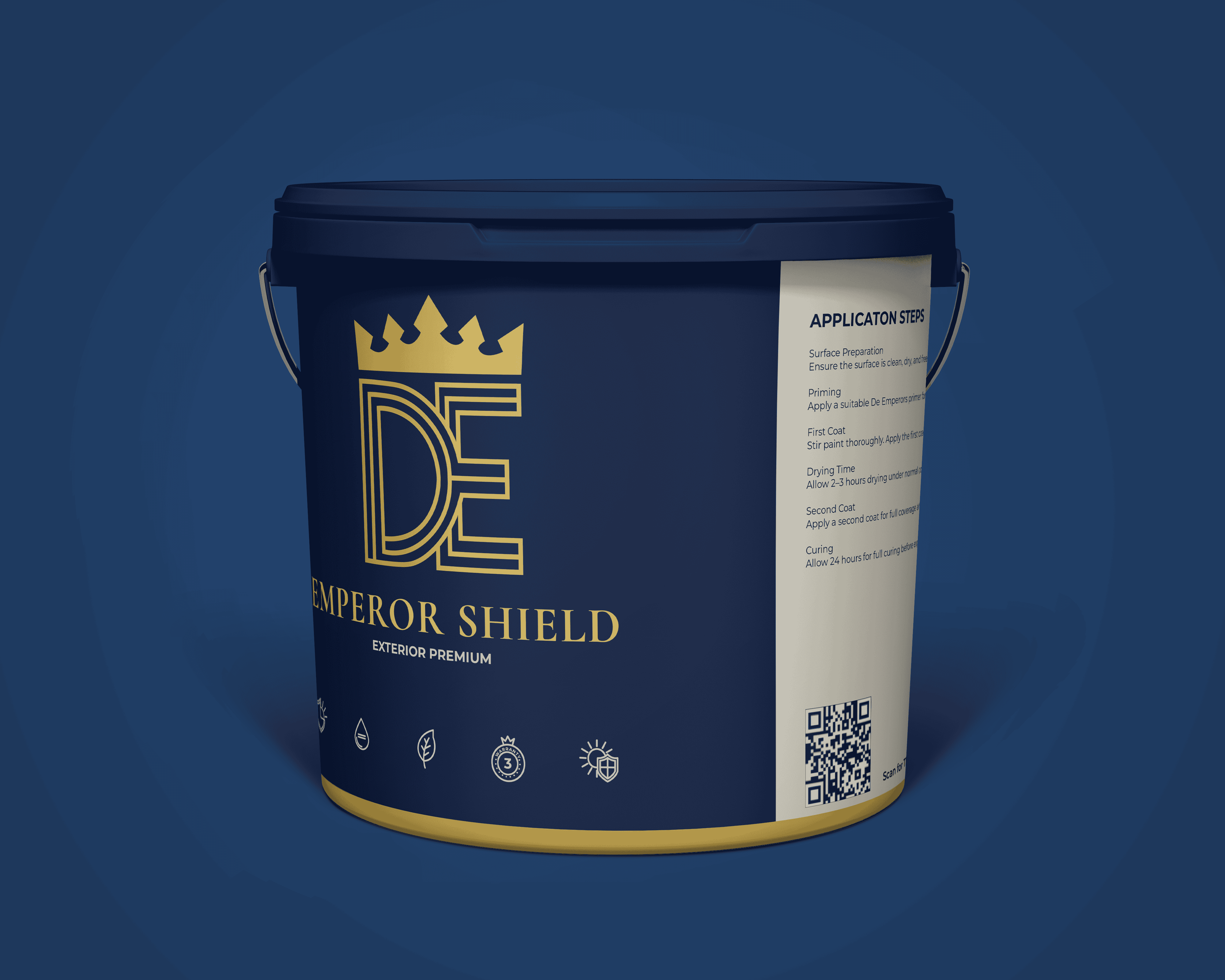
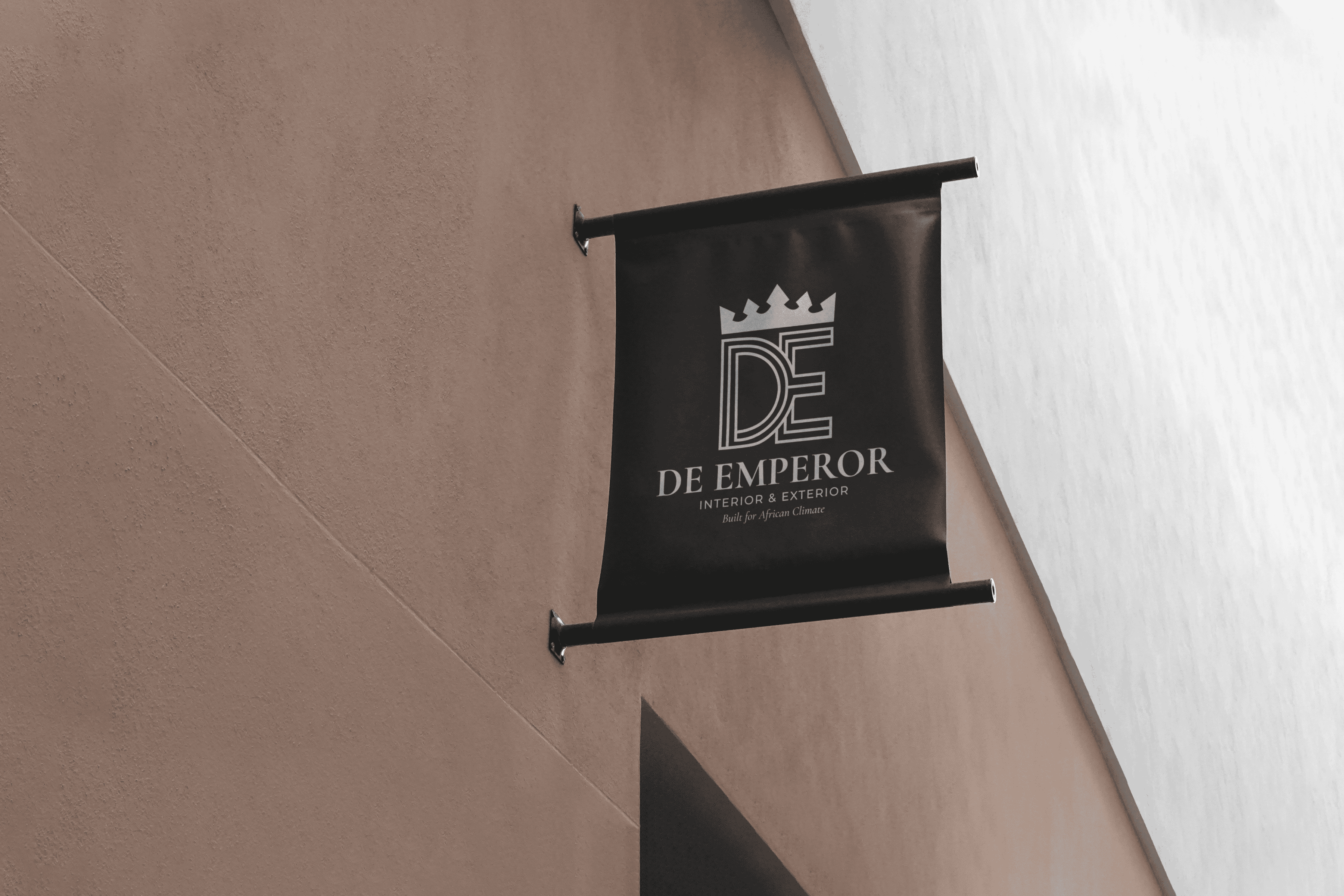
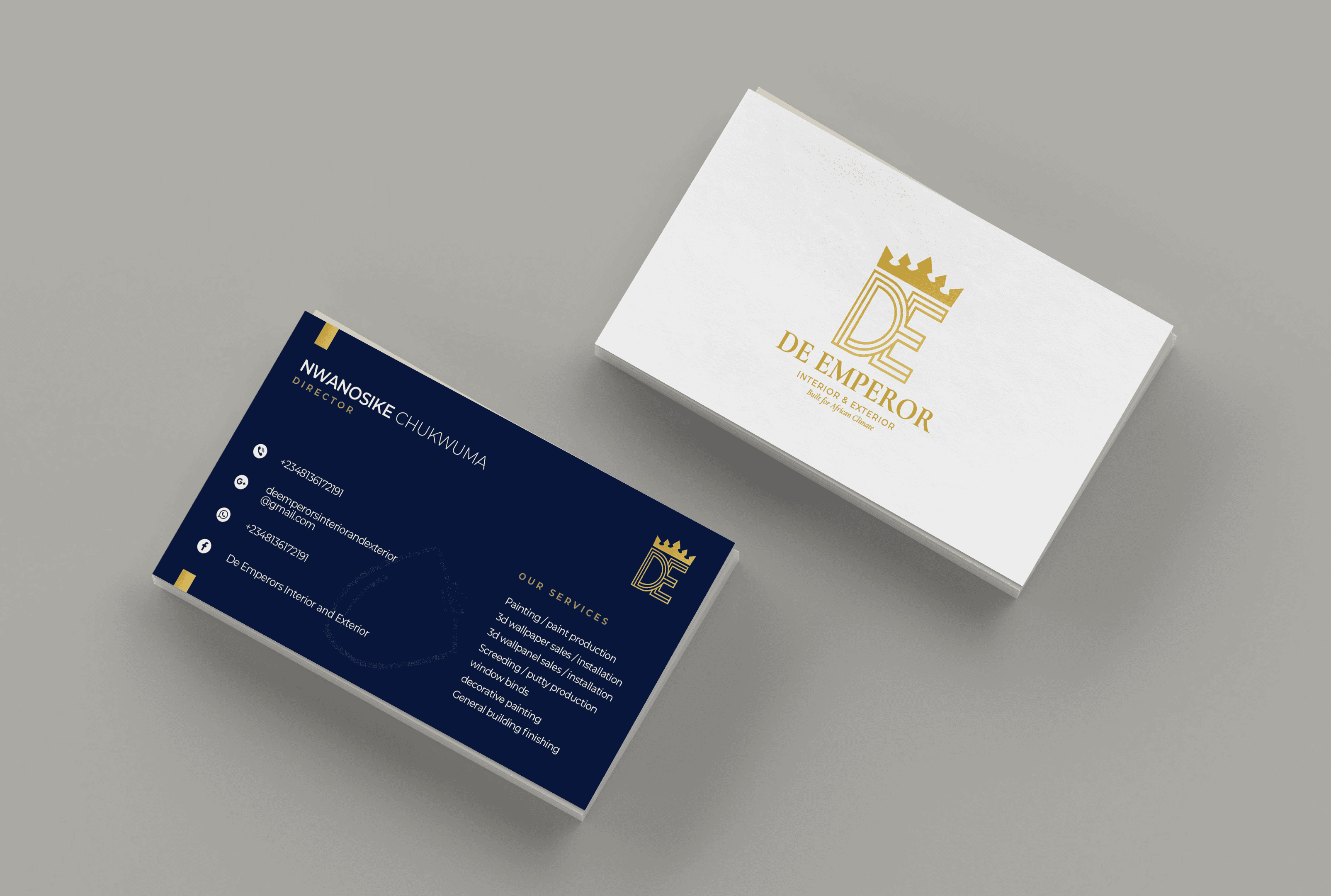
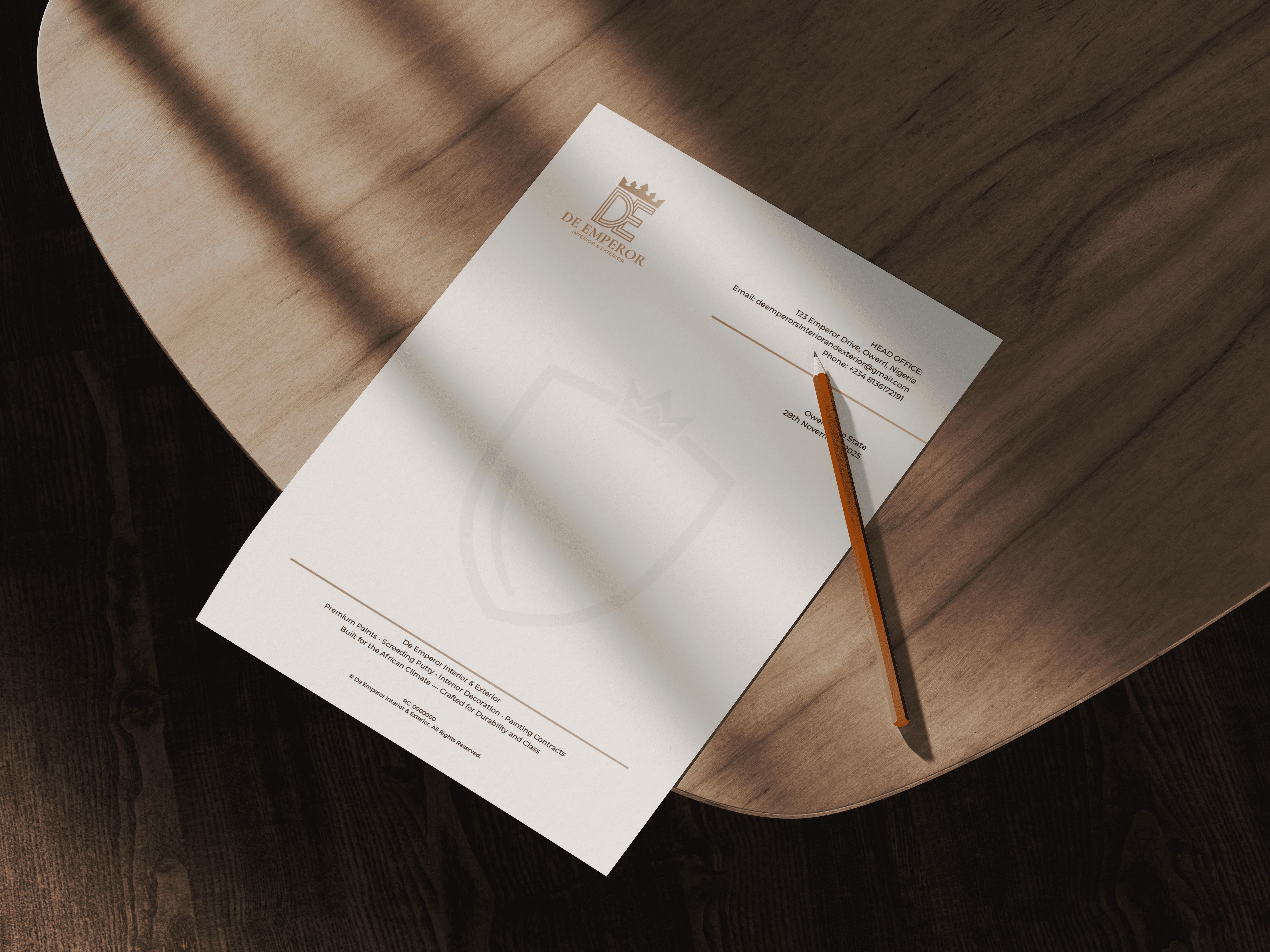
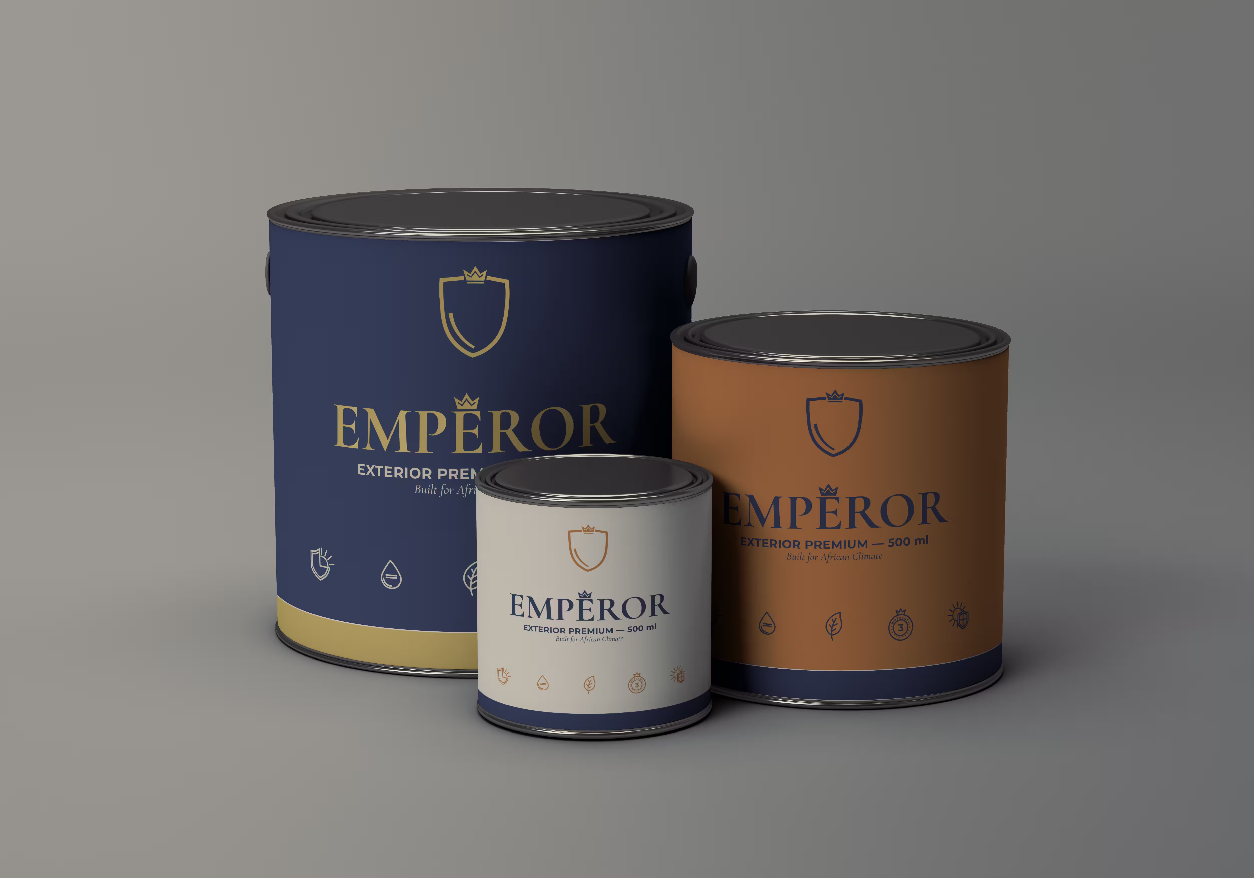
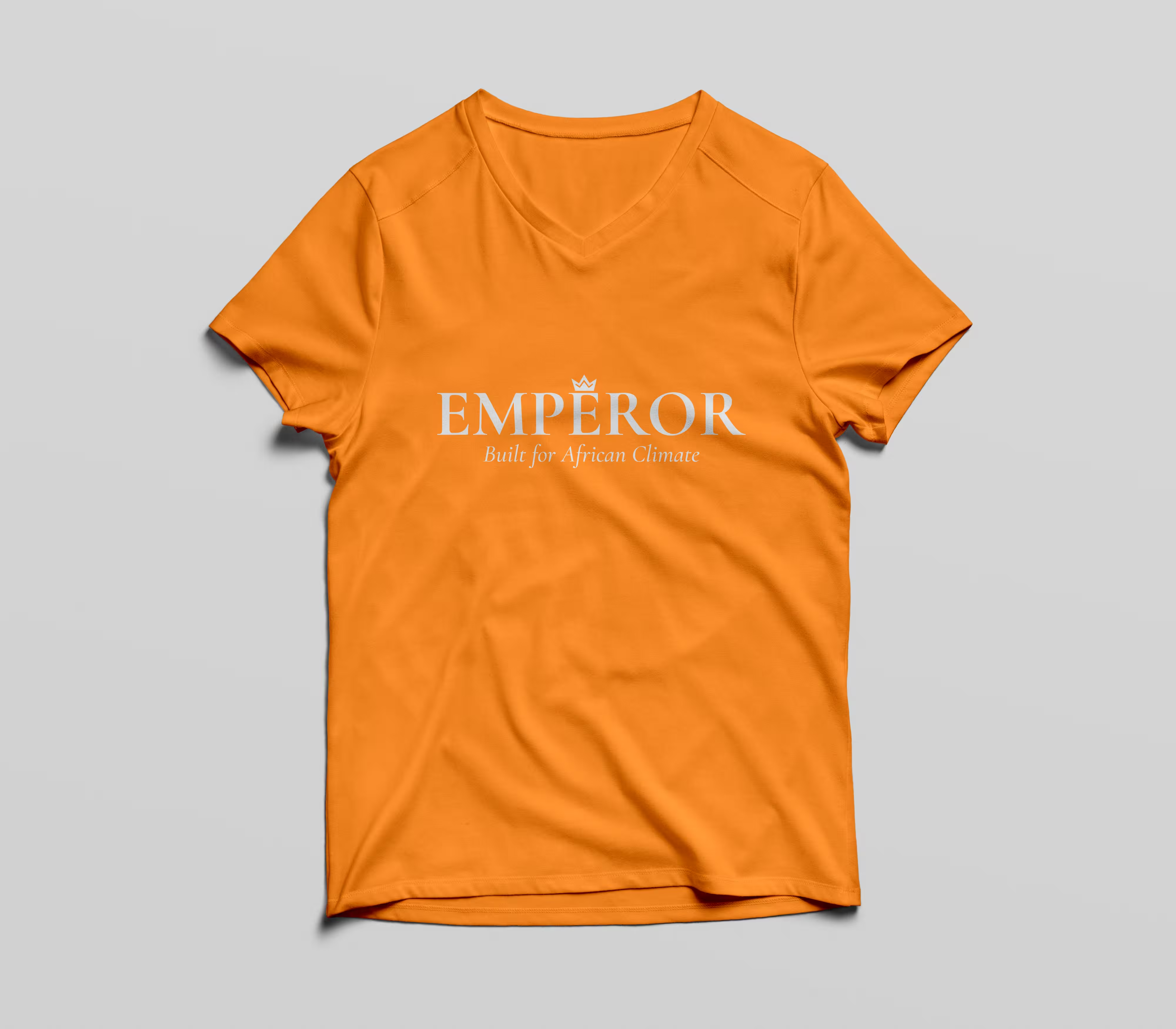
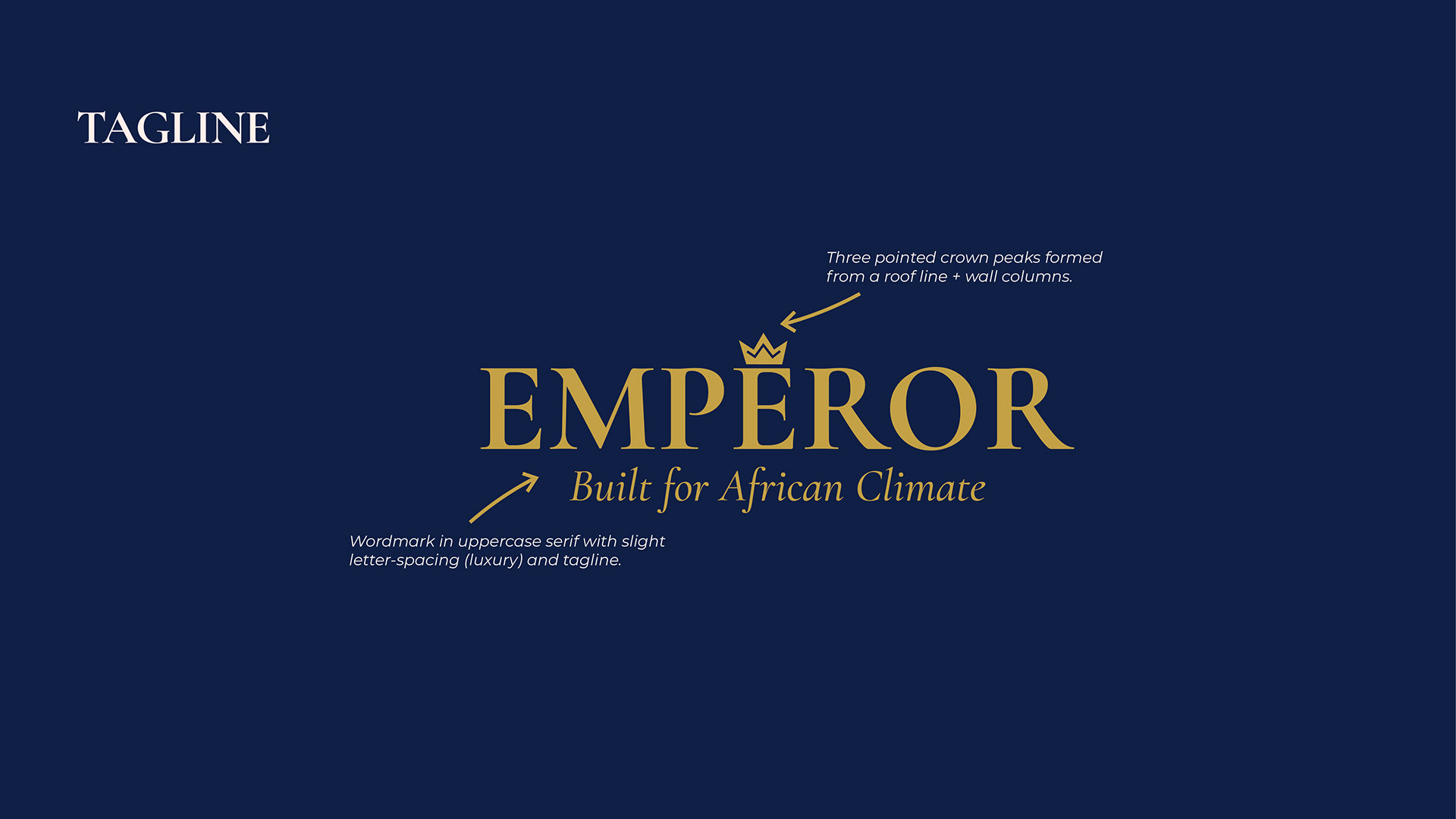
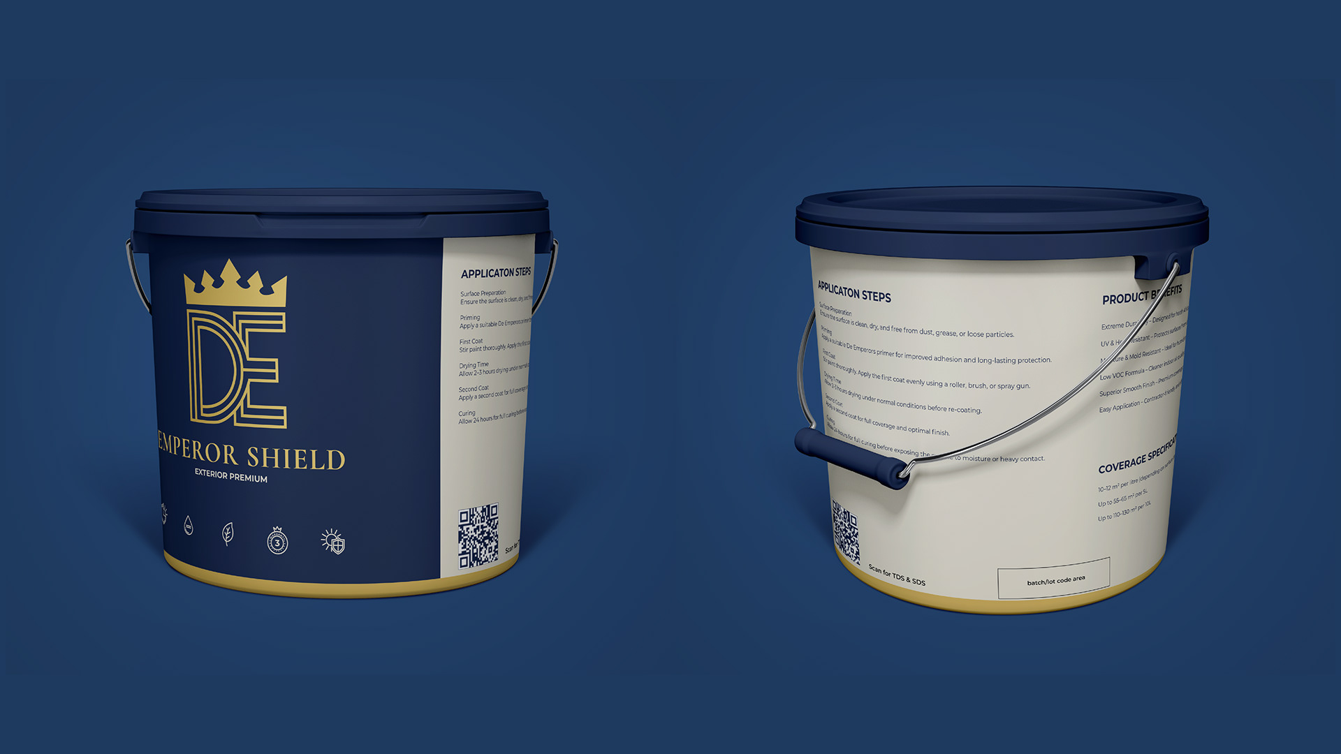
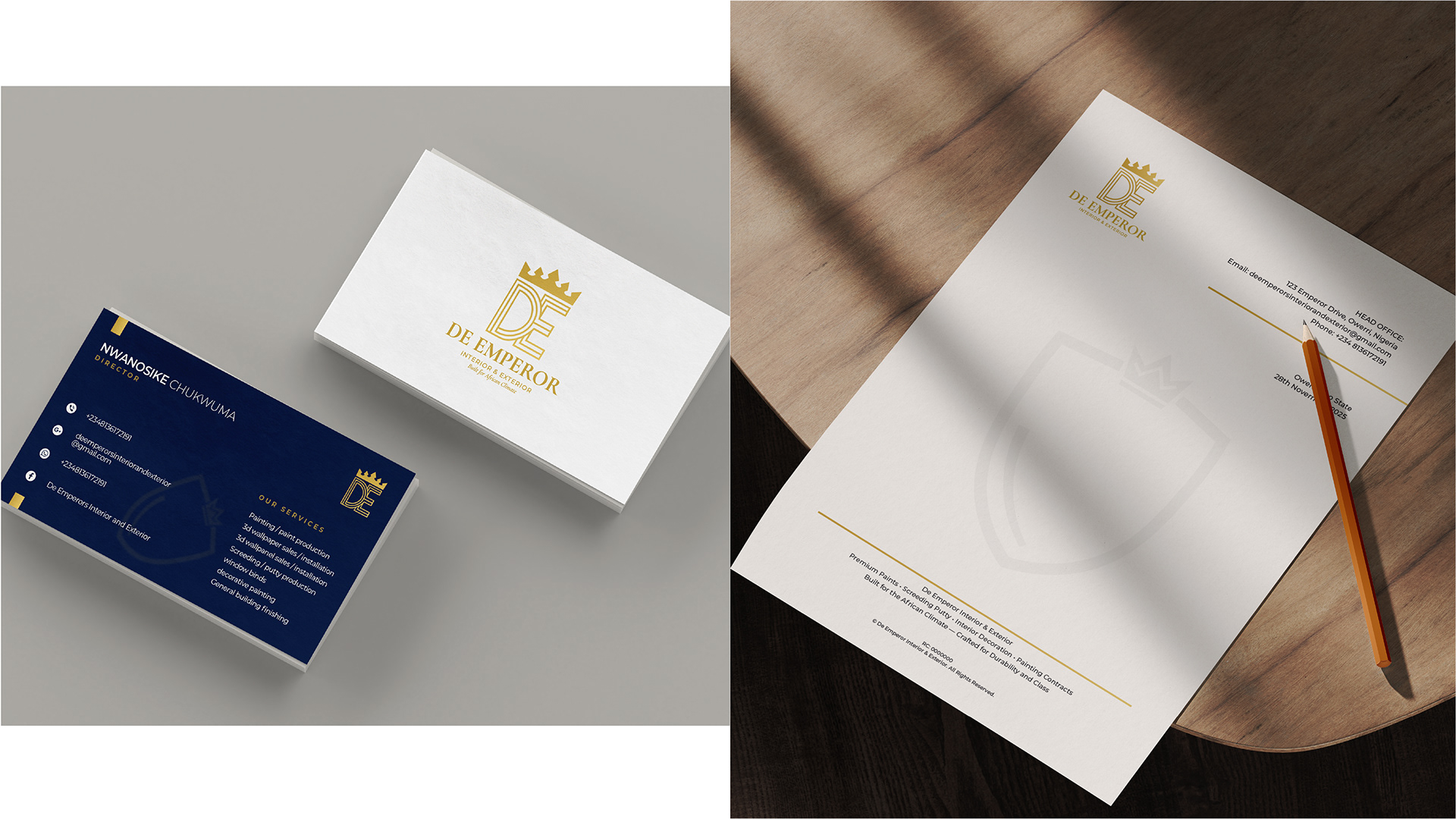
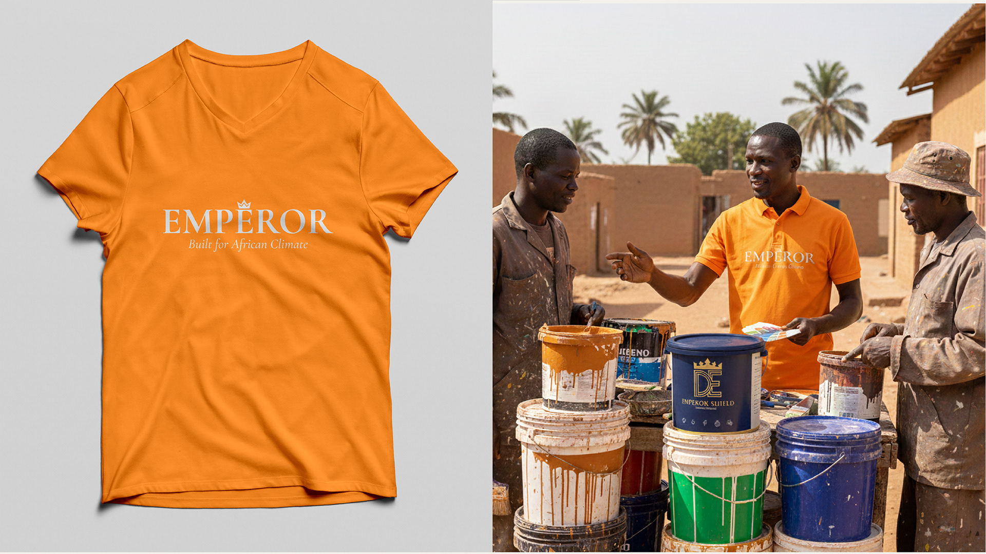
Strategy: I developed a "Classy & Majestic" logo that commands authority. The strategy focused on the USP: "Built for African Weather." This was visually reinforced through the bucket labels and stationery, creating a "Seal of Quality" for the brand.
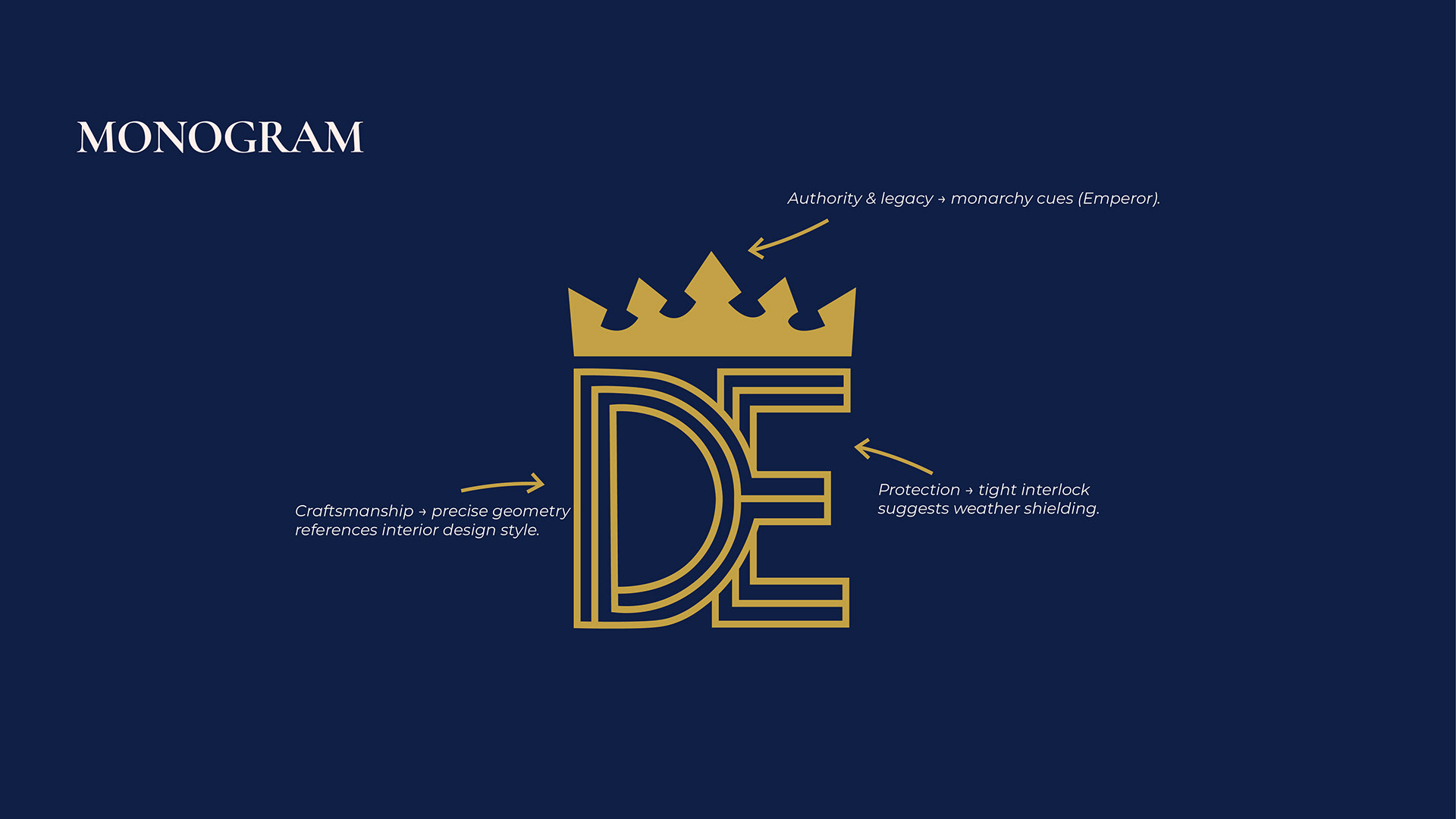
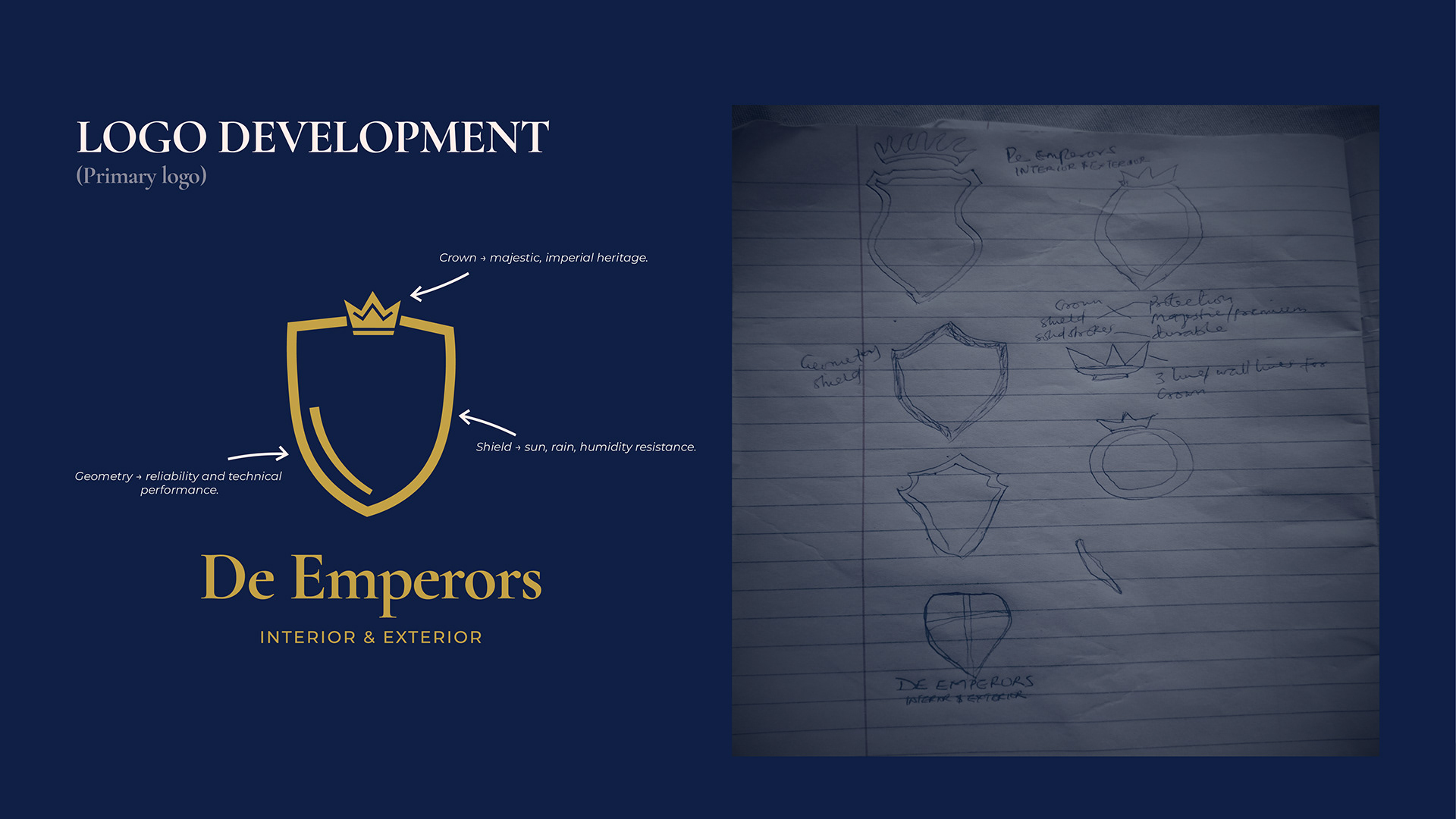

I noticed that De Emperors had a good paint product but lacked a clear brand identity and digital presence.
Rather than waiting for the business to approach me, I reached out to the owner, identified the opportunity, and secured an agreement to work together.
I began the project by understanding the business, its products, customers, and goals.
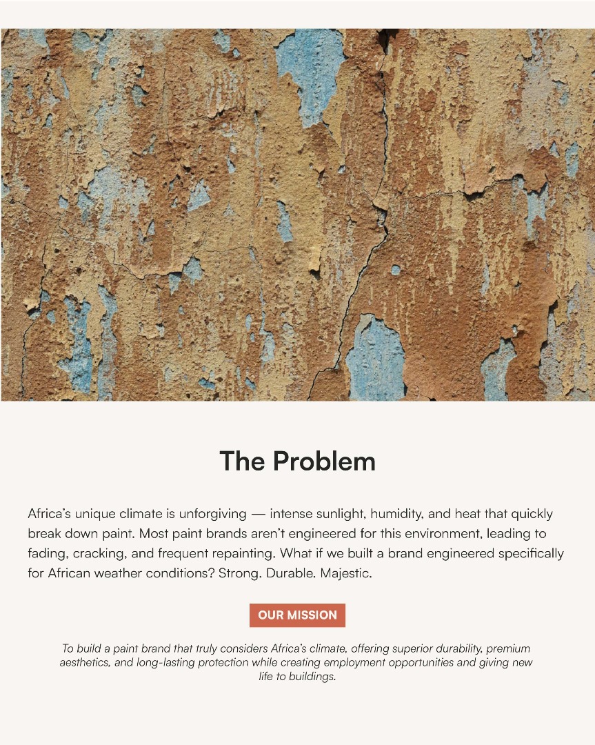
I started by researching the product itself to understand its characteristics, performance, and what made it different from other paints in the market.
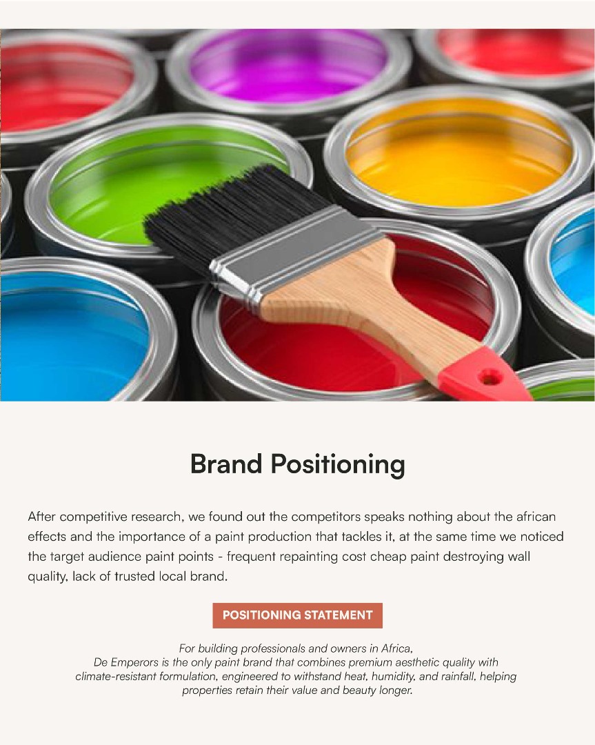
I also conducted competitor research across three competitors provided by the client, reviewing their:
One opportunity stood out.
The paint's durability and performance in African weather could become a strong point of differentiation. I also observed that the established competitors I reviewed were not strongly communicating this idea in their brand messaging.
I developed the positioning around a simple proposition:
Built for African Weather.
I then developed the brand strategy around this positioning and presented it to the client for review and approval before moving into the visual identity.
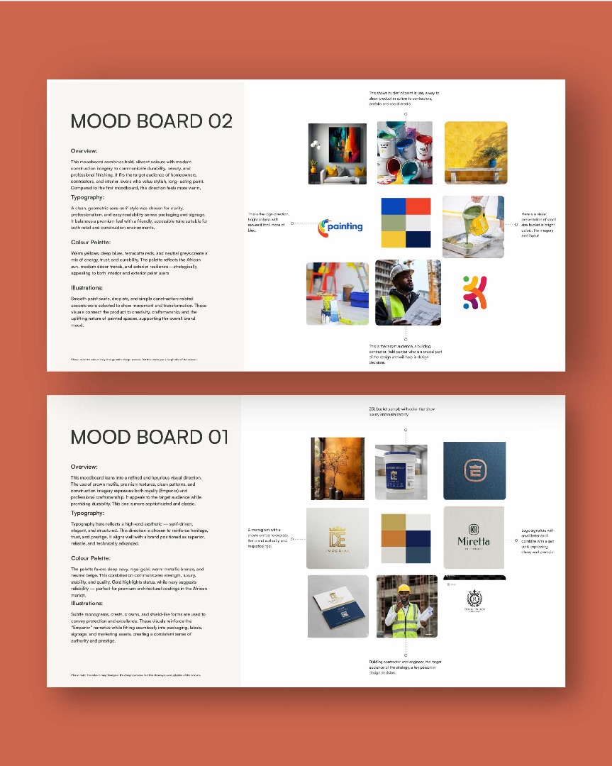
With the strategy approved, I explored two different visual directions through moodboards.
Each direction explored the visual language, typography, colors, imagery, and overall personality that could represent the brand.
The client selected one direction to take forward.
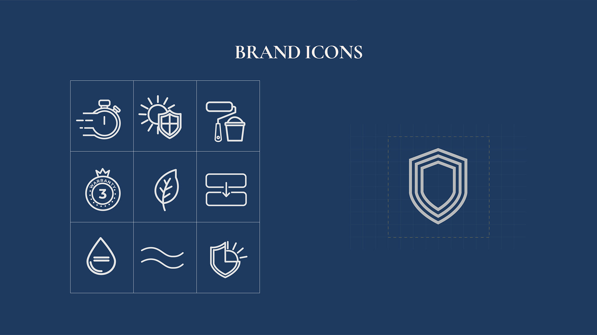
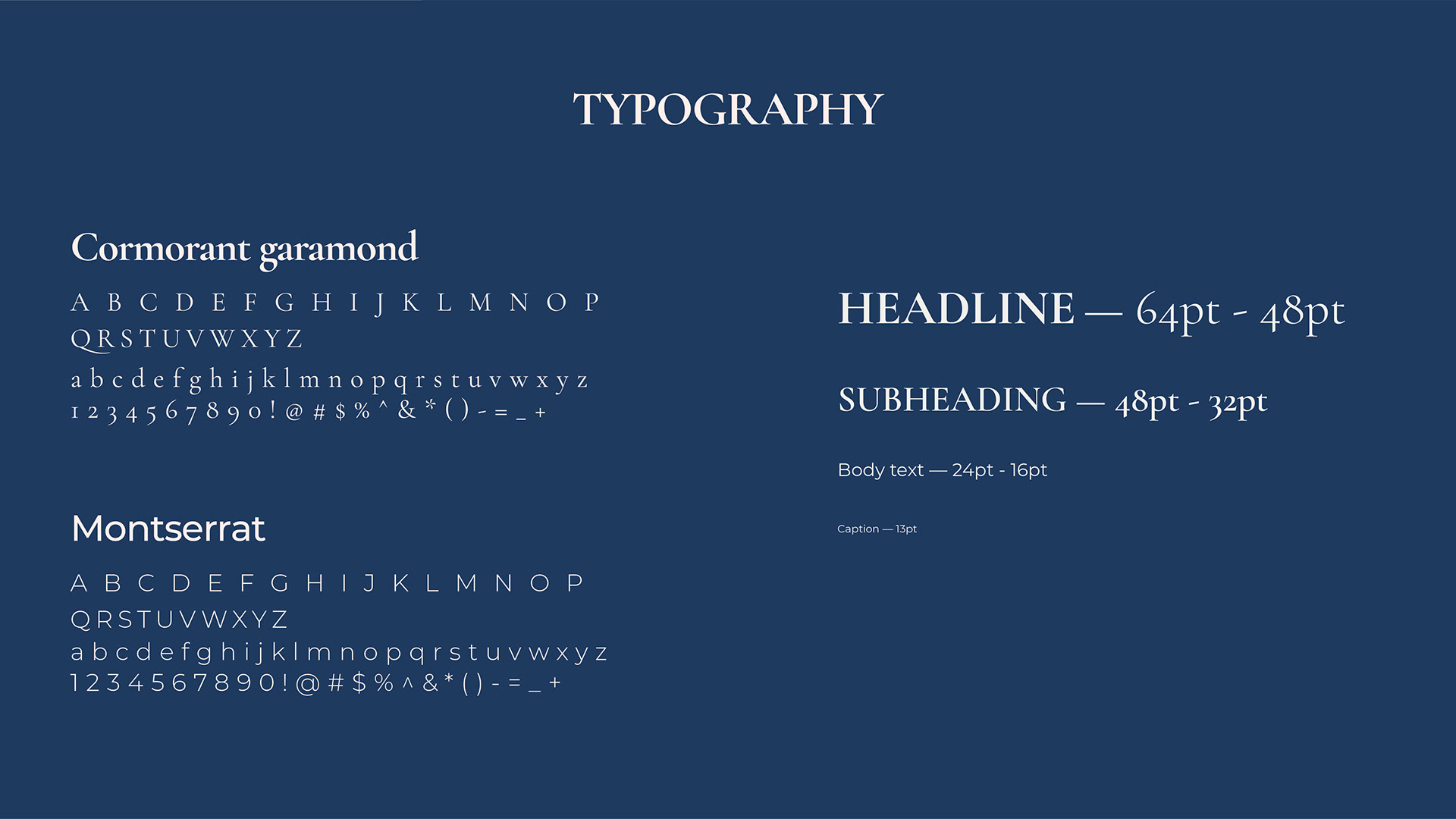
I translated the selected direction into a cohesive visual identity system, including:
The goal was to create an identity that felt professional, distinctive, and consistent across both business and product touchpoints.
I presented the completed identity to the client for approval.
The client approved the work and expressed satisfaction with the result.
I then organized and delivered the complete brand assets and supporting documentation, making the identity easier to use and maintain consistently.

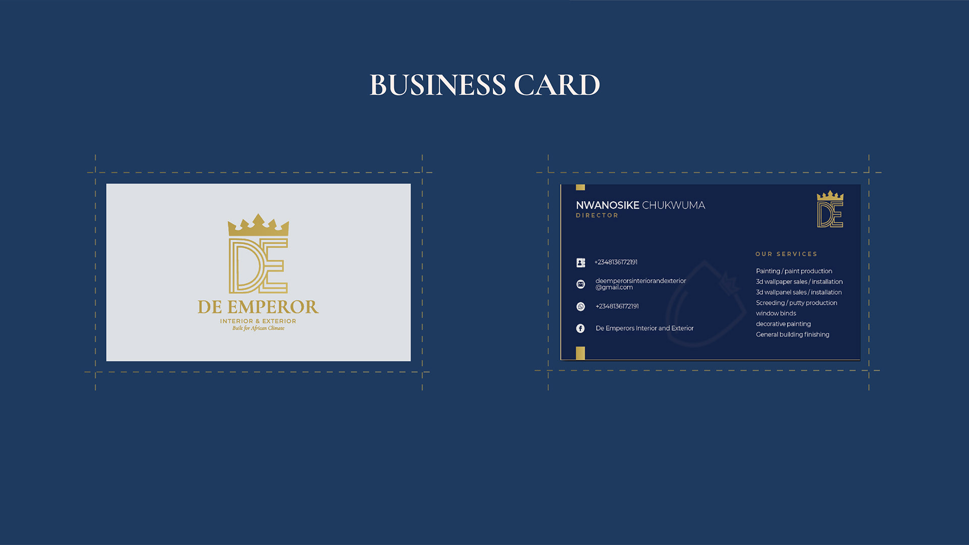
The identity moved beyond the design files and began being used in the business.
The client actively uses the new letterhead for business quotations, giving everyday business communication a more consistent and professional appearance.

According to the client, customers noticed the new identity and responded positively to the changes.
The client also described the business as looking more professional after the rebrand.
I maintained an organized set of the brand assets, which allowed me to quickly retrieve and resend files when the client needed them later.
The new identity is also being considered for physical paint bucket production, extending the brand system from stationery into the product itself.
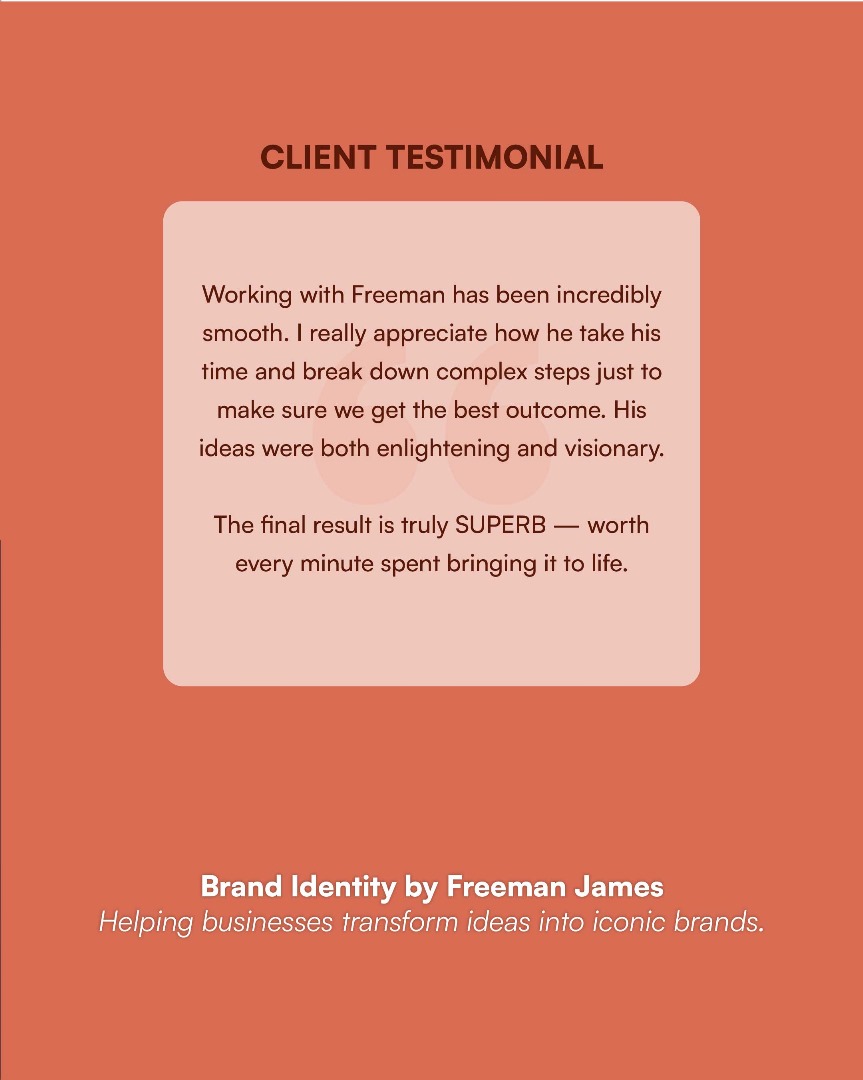
The client described the process as smooth and appreciated the way I explained complex parts of the branding process and brought new ideas to the business.
The final identity was described as “superb.”


I help entrepreneurs and coaches dominate their markets through premium positioning, bold strategy, and modern design that converts.
Get in touch
© 2026 Freeman James. All rights reserved.

