Balancing Homemade Warmth with a Distinctive Digital Experience.
E-commerce
Web design
Strategy
The Challenge: Local Oomph needed an e-commerce experience that captured its homemade, affordable, and trustworthy personality while standing out in the beauty market without losing its warmth and approachability.
The Strategic Move: I researched the skincare and e-commerce space to understand how brands communicate trust, quality, affordability, and product value. I then developed a warm visual direction using serif typography, natural textures, and earthy tones, combined with clear navigation and product-focused storytelling.
Local Oomph is a conceptual e-commerce design project for a homemade beauty brand.
The brief was to create a digital experience that reflected the brand's homemade character and reputation while communicating a sense of innocence, affordability, and trust.
The challenge was to make the brand feel distinctive without losing the warmth and approachability associated with a homemade beauty business.
The project focused on three key goals:
I began by studying the brief and researching the skincare and e-commerce space.
I reviewed existing skincare websites to understand how beauty brands communicate:
This research helped inform the visual direction and structure of the experience.
I developed a visual direction based on the personality defined in the brief.
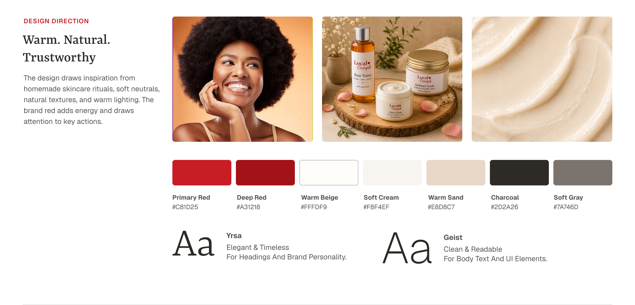
The direction needed to balance two seemingly different qualities:
Homemade and approachable
while still feeling
distinctive and professionally presented.
I selected typography and developed a supporting color palette around the brand's chosen red, using warmer and more natural tones to create a softer visual character.
I designed the website experience around clear product presentation, storytelling, and intuitive navigation.
.jpg)
The design focused on helping visitors understand the brand and its products while creating a simple path toward exploration and purchase.
.jpg)
I used product presentation and visual storytelling to communicate the personality behind the brand rather than treating the website as a simple product catalogue.
.jpg)
I used serif typography, natural textures, and earthy tones to reinforce the homemade character and create a warmer emotional connection with the brand.
.jpg)
I used clear navigation, visual hierarchy, and intentional whitespace to make the experience easier to understand and navigate.
The goal was to create a website that felt trustworthy and approachable while still giving the products enough visual presence to support purchase decisions.



I help entrepreneurs and coaches dominate their markets through premium positioning, bold strategy, and modern design that converts.
Get in touch
© 2026 Freeman James. All rights reserved.

