

American Cancer Hospital Website Redesign
Bridging the gap between Medical Excellence and Patient Empathy.
Healthcare
Web design
Strategy
Challenges: The old site had a "noise" problem. Patients and families were already stressed; a bad UI made finding life-saving information and educational articles even harder.
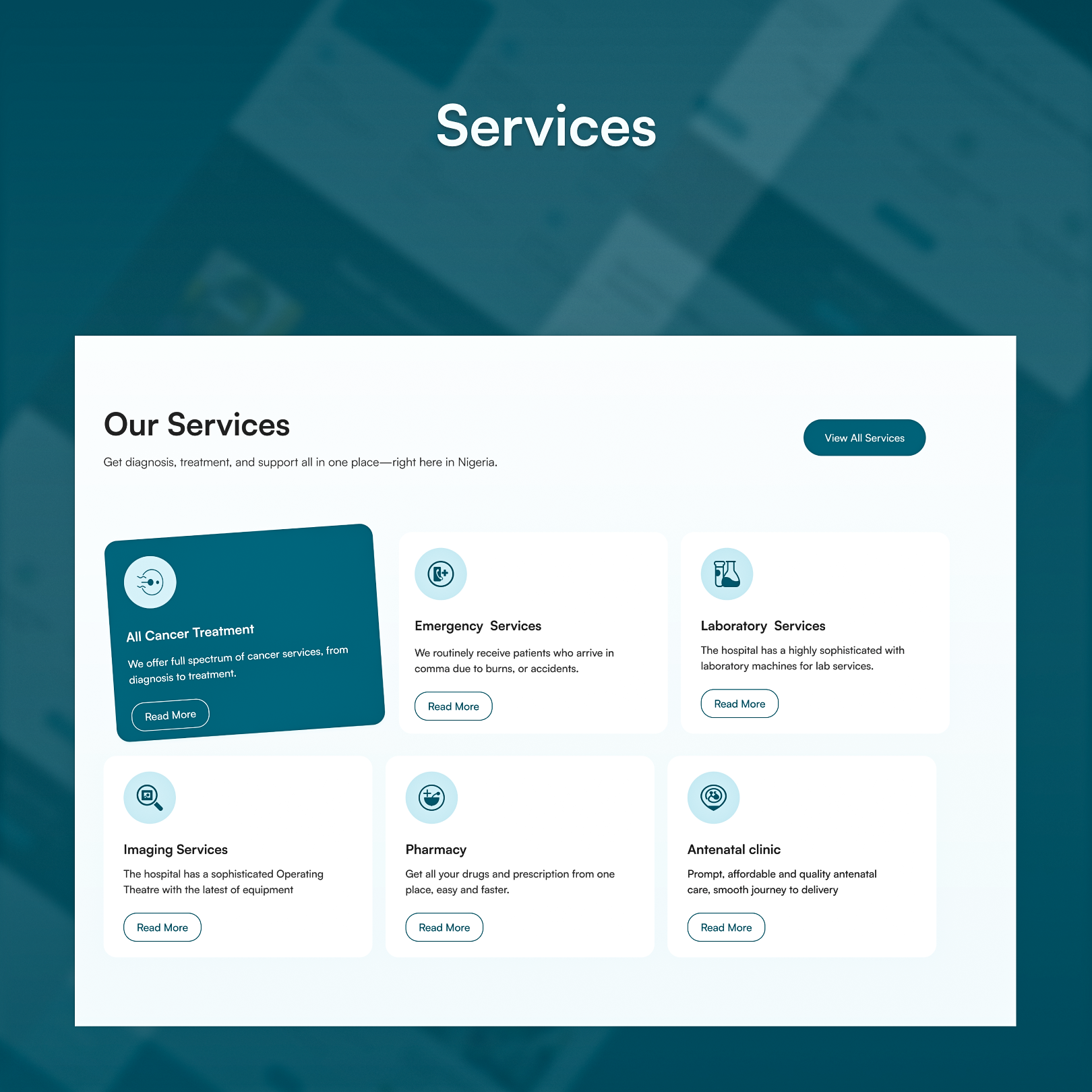
Strategy: We prioritized "Cognitive Ease." By cleaning up the navigation and creating a dedicated, searchable library for educative articles, we moved the brand from "just a hospital" to a "trusted health partner."
.jpeg)
Heading 1
Heading 2
Heading 3
Heading 4
Heading 5
Heading 6
Lorem ipsum dolor sit amet, consectetur adipiscing elit, sed do eiusmod tempor incididunt ut labore et dolore magna aliqua. Ut enim ad minim veniam, quis nostrud exercitation ullamco laboris nisi ut aliquip ex ea commodo consequat. Duis aute irure dolor in reprehenderit in voluptate velit esse cillum dolore eu fugiat nulla pariatur.
Block quote
Ordered list
- Item 1
- Item 2
- Item 3
Unordered list
- Item A
- Item B
- Item C
Bold text
Emphasis
Superscript
Subscript
Problem
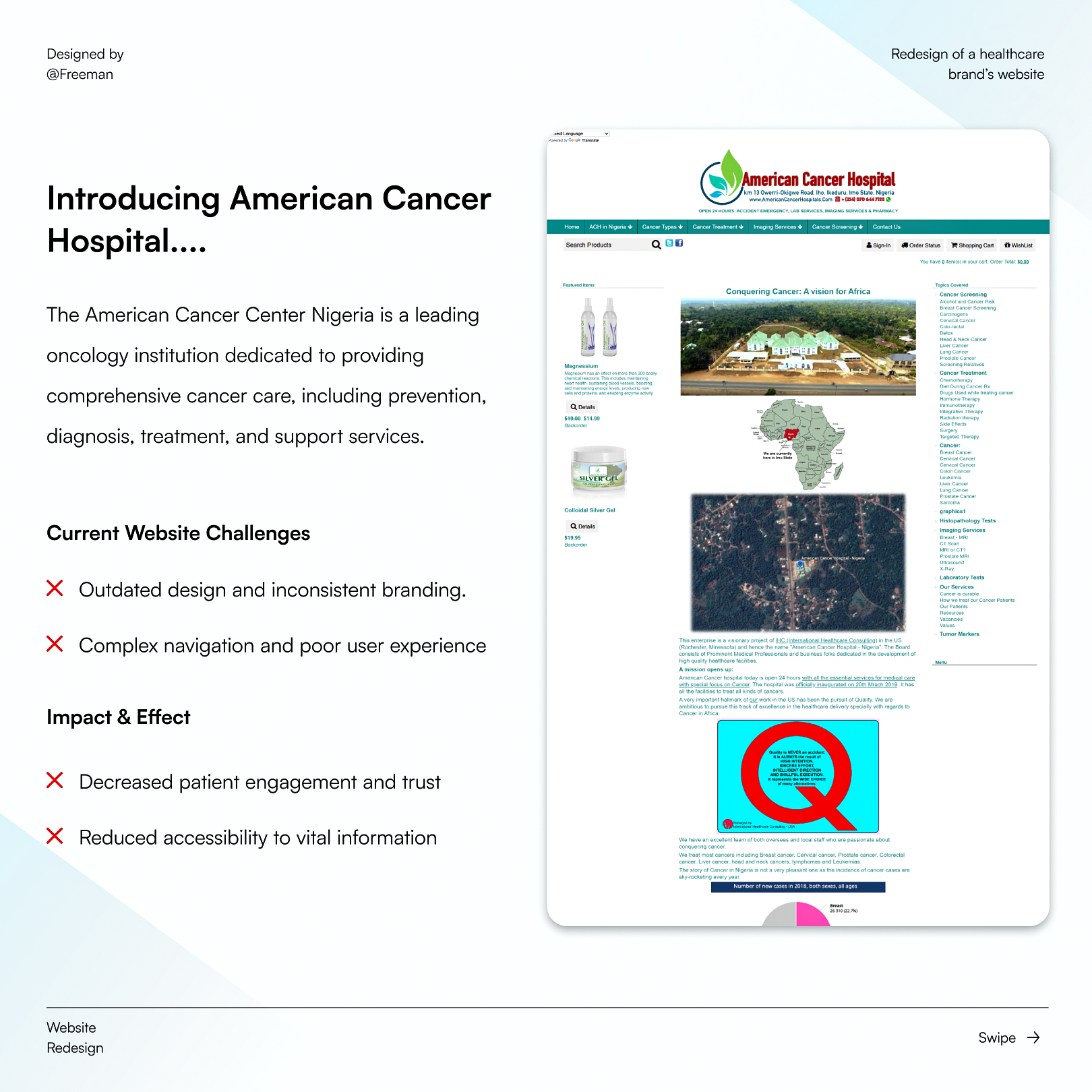
I discovered the hospital’s existing website while searching for a cancer hospital for my mum. As a first-time visitor, I struggled to understand the site and find the information I needed.
My evaluation revealed several usability and visual issues:
- Poor spacing and margins
- Inconsistent icon sizing
- Weak visual hierarchy
- Ineffective use of grids and columns
- Difficult-to-find content
- Navigation that made information discovery unnecessarily difficult
- An overall outdated digital experience
But the deeper problem went beyond visual design.
The hospital had a stronger brand and service proposition than its website communicated.
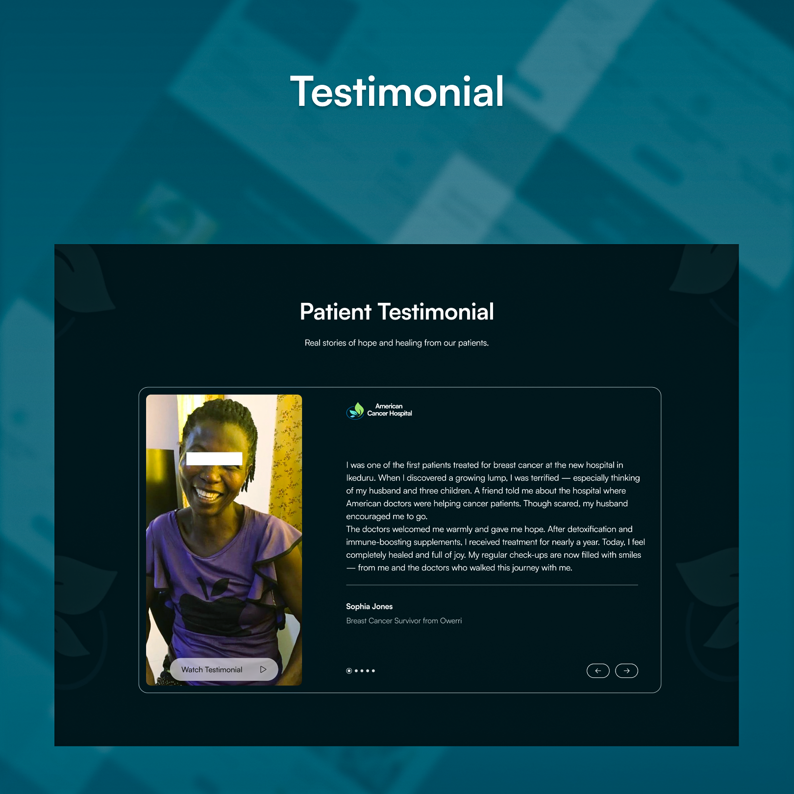
The hospital provided valuable cancer education and had collaborations with international organizations, but these strengths were not effectively surfaced through the website.
The institution had information that could help build patient trust and credibility, but its information architecture and navigation made that value difficult to discover.
My Approach
01 — Existing Experience Audit
I personally navigated the existing website from the perspective of someone actively looking for cancer care.
I evaluated the experience across navigation, content discovery, layout, visual hierarchy, spacing, and overall usability to identify where the experience was creating friction.
02 — Competitive Research
I studied local healthcare competitors and international healthcare organizations to understand how they approached:
- Website structure and user experience
- Healthcare messaging
- Brand positioning
- Taglines and value propositions
- Patient education
- Trust and credibility
- Social media communication
This helped me understand not just how healthcare websites were designed, but how healthcare organizations communicate expertise, trust, and credibility.
03 — Information Architecture
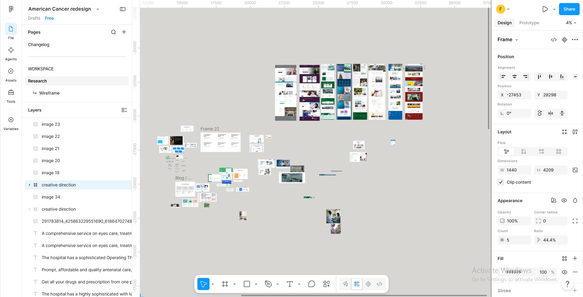
I restructured the experience around a clearer information architecture, focusing on:
- Simpler navigation
- Better content organization
- Clearer content hierarchy
- Easier information discovery
The goal was to make important information easier to find, particularly for visitors who may already be dealing with the uncertainty and stress that comes with seeking cancer care

04 — Visual Design
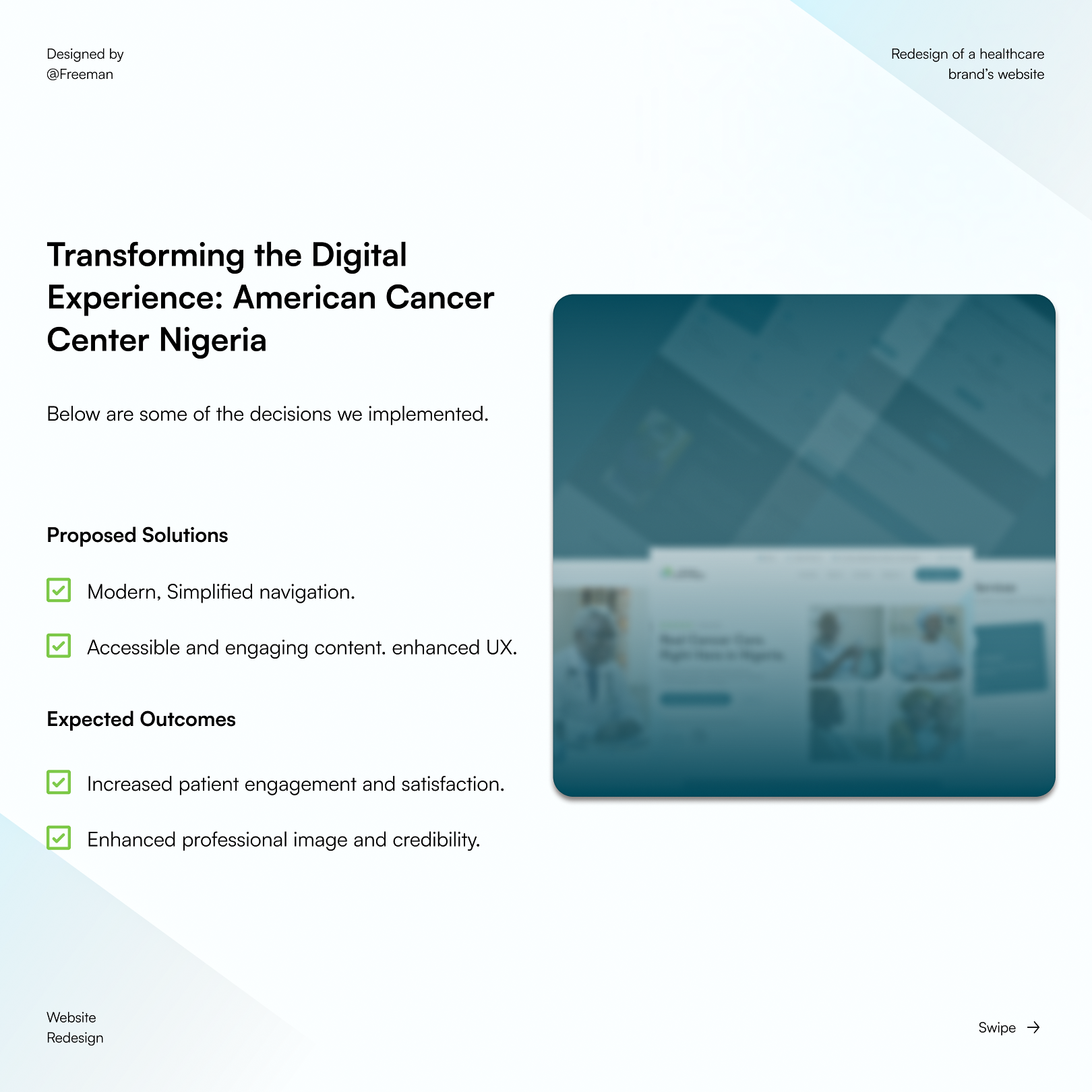
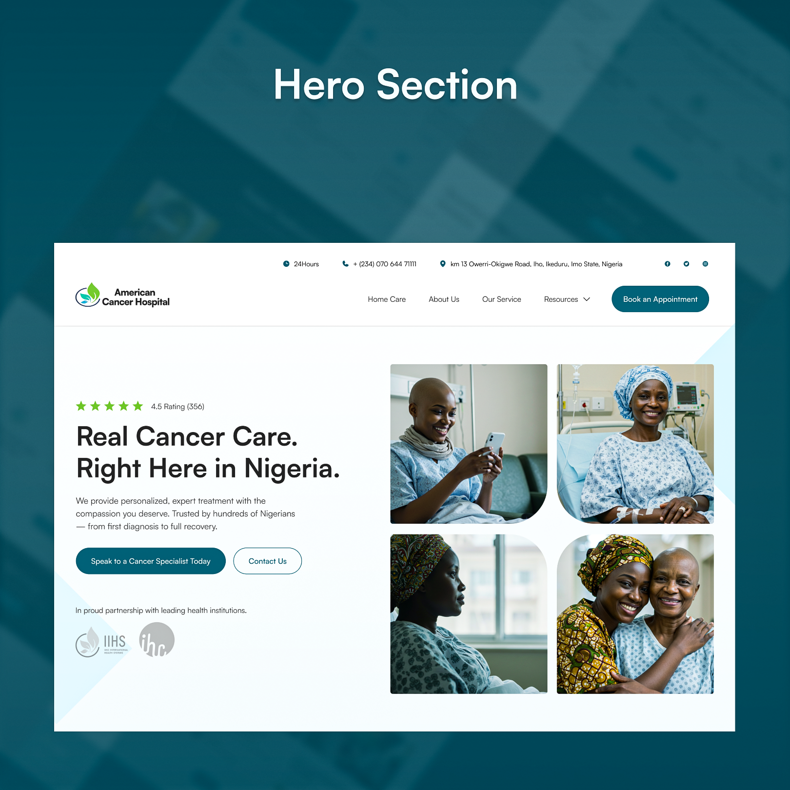
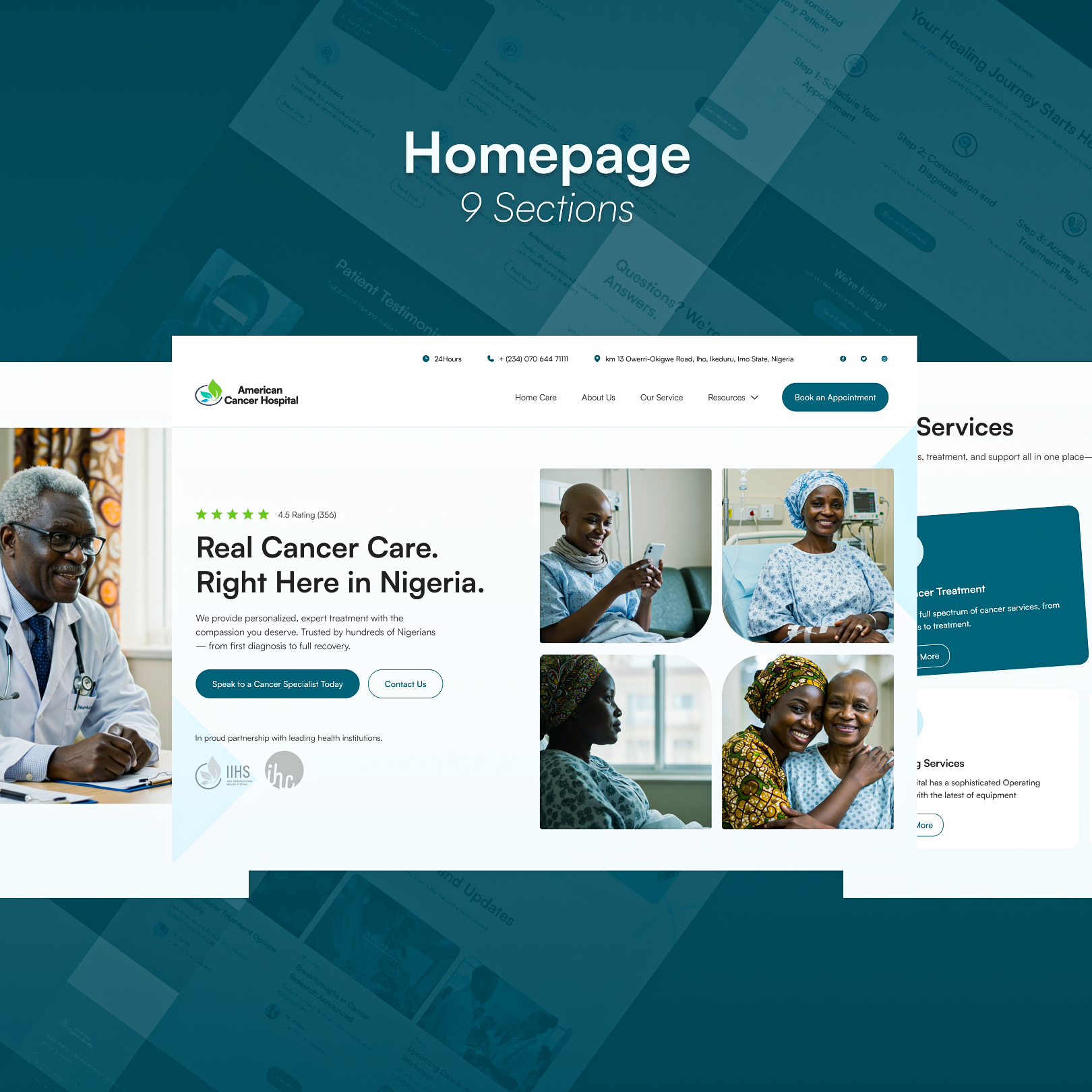
I redesigned the visual experience to better communicate the hospital's existing strengths and service quality.
Rather than changing the brand for the sake of change, the redesign focused on creating a more modern, structured, and trustworthy digital experience that could better represent the institution.

05 — Deliverables
The redesign included:
- Sitemap
- Wireframes
- Website redesign
- Content and information hierarchy
06 — Stakeholder Validation
I presented the redesign concept to the hospital manager.
His response was positive, and he asked me to develop a proposal for the hospital.
The project ultimately did not proceed because communication stopped afterward.
Although the redesign was not implemented, the project demonstrated how research, information architecture, and visual design could transform an existing healthcare website into a clearer and more trustworthy digital experience.
Let’s talk about a project together
Websites
Branding
Logo
Copywriting
Webflow
Wordpress
Strategy
UI/UX
Visuals
Elementor
E-commerce
SaaS
Healthcare


I help entrepreneurs and coaches dominate their markets through premium positioning, bold strategy, and modern design that converts.
Get in touch
© 2026 Freeman James. All rights reserved.