

UYE Store (E-commerce UX Design)
Helping Customers Make Better Product Decisions Through Curation, Clarity, and Trust.
E-commerce
UX design
Strategy
Challenges: UYE needed an e-commerce experience that could reduce the overwhelm caused by too many similar products, unclear information, and concerns about authenticity and quality. Research with three users revealed that customers needed more than product discovery. They needed confidence in what they were buying.
Strategy: I shifted the experience from simply displaying products to supporting better purchase decisions. I introduced lifestyle-led discovery, clear product information, reviews, warranty, authenticity signals, Pay on Delivery, and a simplified journey from discovery to purchase.
Heading 1
Heading 2
Heading 3
Heading 4
Heading 5
Heading 6
Lorem ipsum dolor sit amet, consectetur adipiscing elit, sed do eiusmod tempor incididunt ut labore et dolore magna aliqua. Ut enim ad minim veniam, quis nostrud exercitation ullamco laboris nisi ut aliquip ex ea commodo consequat. Duis aute irure dolor in reprehenderit in voluptate velit esse cillum dolore eu fugiat nulla pariatur.
Block quote
Ordered list
- Item 1
- Item 2
- Item 3
Unordered list
- Item A
- Item B
- Item C
Bold text
Emphasis
Superscript
Subscript
UYE STORE
Designing a more trusted and less overwhelming way to shop for everyday gadgets and lifestyle products
Role: Product Designer / UX Designer
Project: E-commerce / Lifestyle Commerce
Scope: UX Research → Product Strategy → Information Architecture → User Flows → Wireframes → Prototyping
Status: UX phase completed; UI design and development not yet started
Research: 3 qualitative user interviews + competitor analysis
Tools: Figma, Chatgpt
The Project
Shopping online should make finding a product easier.
But for many shoppers, the opposite happens.
There are too many products, similar options, unclear product information, concerns about authenticity, and uncertainty about whether what they see online is what they will actually receive.
UYE Store is a proposed lifestyle commerce platform designed around a different idea:
Don't make customers search through everything. Help them find something that fits their needs.
The concept focuses on curated everyday products and gadgets that support productivity, relaxation, travel and everyday living, while giving customers enough information and trust signals to make confident purchasing decisions.
The challenge was to determine:
How might we create an e-commerce experience that reduces decision fatigue while increasing trust and purchase confidence?
The Business Context
UYE wanted to establish itself in a competitive e-commerce market.
The initial business goal was straightforward:
Convert visitors into buyers through trust, clarity and emotional lifestyle positioning.
The longer-term ambition was to become a top-of-mind lifestyle accessories store for its target audience.
Target audience
Young working professionals, approximately 26–45, across Nigeria and the African diaspora who:
- value convenience
- appreciate useful technology
- are interested in growth and innovation
- shop online during their leisure time
- want products that improve everyday life
Rather than simply selling "gadgets", UYE wanted to position products around the benefit they bring to people's lives.
The Problem
The initial assumption was that UYE needed a better online store.
Research revealed that the problem was deeper.
Customers weren't simply asking:
"Where can I buy this?"
They were often asking:
"Which one should I buy?"
"Can I trust this seller?"
"Is this product actually what I'm seeing?"
"Is this worth my money?"
"What makes this product different from the other five?"
This shifted the design challenge from building an online catalogue to designing a decision-making experience.
Research Approach
I conducted qualitative interviews with three users who had experience purchasing gadgets, accessories or everyday products online.
I wanted to understand:
- What triggers an online purchase?
- How do users discover products?
- What causes decision fatigue?
- What information do they need before buying?
- What makes an online store trustworthy?
- What makes them abandon a purchase?
- What brings them back?
- How do price, reviews and product information influence decisions?
I also reviewed competing experiences, particularly:
- Jumia
- Oraimo
I examined:
- Navigation
- Information architecture
- Login and signup
- Product information
- Trust signals
- Wishlist
- Checkout
- Customer support
- Order placement
- Post-purchase experience
What Users Told Me
The interviews revealed several recurring behavioural patterns.
Online shopping is valuable because it saves time
One participant compared online shopping with physical stores and explained that online shopping makes it easier to:
- see multiple options
- compare prices
- work within a budget
- shop from home
- make faster decisions
Design implication
UYE shouldn't recreate the friction of physical shopping online.
The experience should make comparison and decision-making faster, not harder.
Discovery Starts Outside the Store
Users mentioned discovering products through:
- TikTok
- WhatsApp Status
- Social media advertisements
- Friends/recommendations
This means the homepage isn't necessarily the first experience users have with UYE.
A user might arrive directly on a product or campaign page.
Design implication
Every landing experience needs enough context to answer:
What is this? Why should I trust it? Why should I buy it?
Too Many Similar Choices Create Confusion
One participant explained that confusion happens when:
- brands are familiar
- prices are similar
- designs are similar
- there are multiple attractive options
Another described becoming confused when products appear to solve the same problem but have different ingredients or features.
This was one of the strongest insights from the research.
Design implication
UYE shouldn't compete by simply displaying more products. It should compete through curation and guidance.
Trust Is a Major Purchase Barrier
Users expressed concerns about:
- receiving something different from what they saw online
- product quality
- authenticity
- unreliable vendors
- delayed returns or warranty processes
- online fraud
One participant specifically highlighted the fear of paying for one product and receiving something different.
What builds trust?
The interviews highlighted:
Product reviews
Detailed information
Pay on Delivery
Warranty
Recommendations from people they know
Interestingly, social media presence was considered less important than these practical trust signals.
Design implication
Trust shouldn't be hidden in an "About Us" page.
It should appear at the point of decision.
Users Want Information Before They Commit
The most important product information mentioned included:
- Price
- Reviews
- Product description
- Specifications
- Product features
This became one of the foundations of the product-detail experience.
Instead of simply showing:
Image + Name + Price + Buy
the UYE product page should help answer:
What does this do?
Who is it for?
What makes it useful?
Is it authentic?
What are its specifications?
Can I trust it?
When will I receive it?
Affinity Mapping
After the interviews, I grouped observations into behavioural themes.
Discovery
- Social media
- Ads
- Recommendations
- Status updates
Decision Making
- Price
- Reviews
- Specifications
- Product description
- Quality
Trust
- Pay on Delivery
- Warranty
- Reviews
- Known vendors
- Detailed information
Frustrations
- Too many similar choices
- Unclear information
- Fear of receiving something different
- Poor quality
- Difficult returns
Motivations
- Convenience
- Saving time
- Finding useful products
- Affordability
- Comfort
- Productivity
Retention
- Product quality
- Customer service
- Fast delivery
- Trust
- Easy shopping
The Core Opportunity
The research led to one central opportunity:
UYE can differentiate itself not by having the most products, but by helping customers make better product decisions.
This became the foundation of the product strategy.
User Personas
Rather than designing for an abstract "online shopper", I translated the research into behavioural personas.
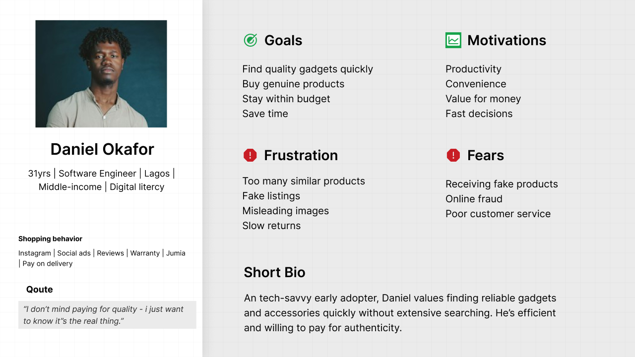
The Practical Explorer
Primary motivation: Find useful products without wasting time.
Goals
- Find products quickly
- Understand what a product does
- Stay within budget
- Buy with confidence
Frustrations
- Too many similar products
- Poor product descriptions
- Unclear quality
- Fear of scams
Needs
- Curated collections
- Clear product benefits
- Reviews
- Specifications
- Trust signals
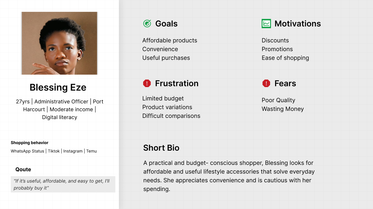
The Value-Seeking Shopper
Primary motivation: Get useful products at an affordable price.
Goals
- Discover affordable products
- Compare options
- Find deals
- Minimize purchasing risk
Frustrations
- Unclear quality
- Attractive products with poor quality
- Delivery concerns
Needs
- Transparent pricing
- Reviews
- Product information
- Delivery information
- Pay on Delivery
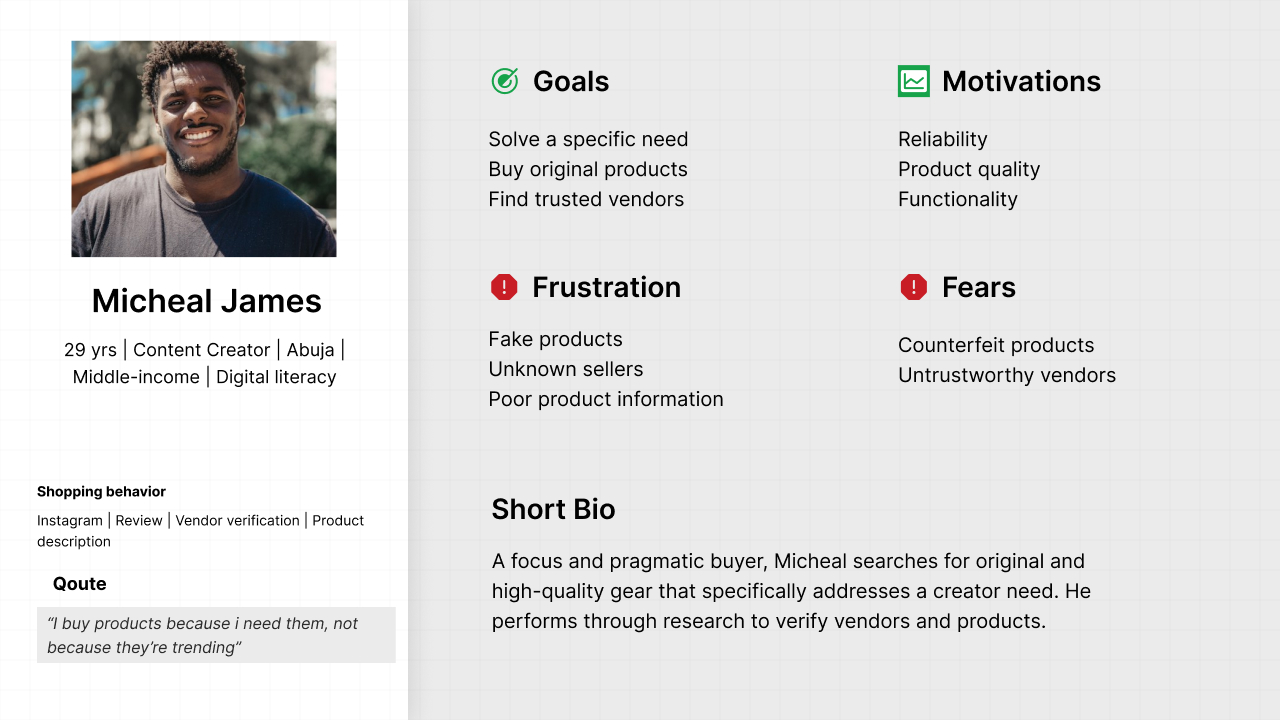
Empathy Map
The research also revealed what users are experiencing beyond the interface.
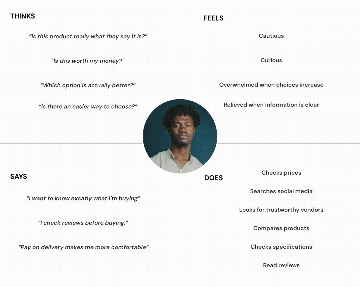
THINKS
"Is this product really what they are showing me?"
"Which one should I choose?"
"Is this worth the money?"
FEELS
- cautious
- overwhelmed
- curious
- excited
- uncertain
SAYS
"I check reviews."
"I check the specifications."
"I want to know if it is original."
DOES
- compares prices
- checks reviews
- examines specifications
- searches social media
- considers recommendations
- evaluates delivery options
This helped move the design from feature-driven to behaviour-driven.
User Journey
I mapped the customer's experience from discovery through post-purchase.
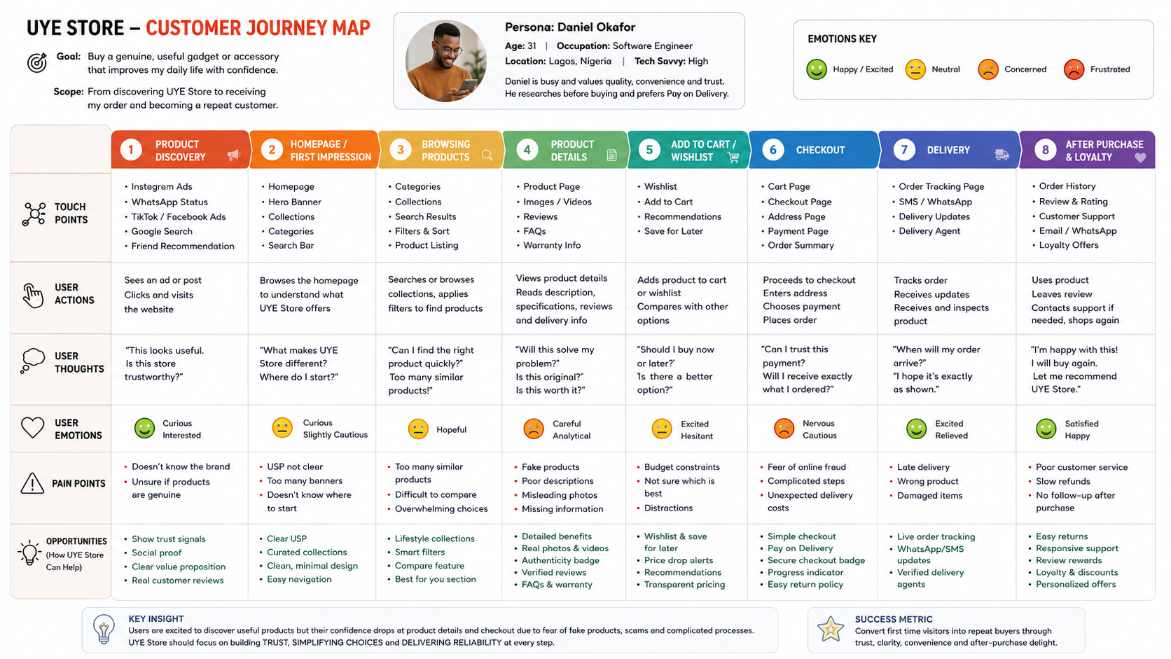
Stage - User Goal - Pain Point - UYE Opportunity
Discover - Find something useful - Too many products online - Lifestyle-led discovery
Explore - Understand options - Similar products - Curated collections
Evaluate - Decide confidently - Trust concerns - Reviews + specs + warranty
Purchase - Complete order - Payment anxiety - Pay on Delivery
Wait - Know what is happening - Delivery uncertainty - Order tracking
Receive - Confirm satisfactiom - Quality concerns - Support + returns
Return - Buy again - Previous experience determines trust - Reliable service
Competitor Analysis
I examined Jumia and Oraimo to understand what they do well and where an opportunity exists for UYE.
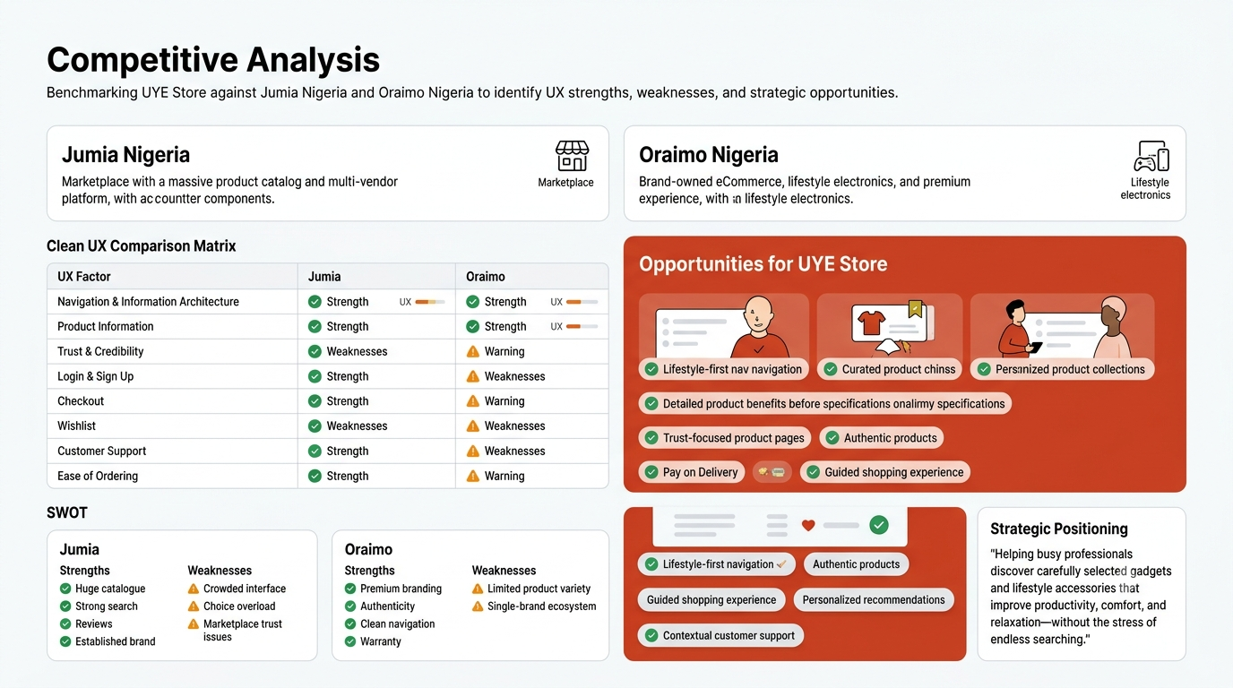
Jumia
Strengths
- Large product selection
- Strong marketplace familiarity
- Multiple price points
- Pay on Delivery
- Search and filtering
- Order tracking
- Established logistics
Weakness
The breadth that makes Jumia powerful can also create decision overload.
Oraimo
Strengths
- Strong product branding
- Clear category structure
- Product-focused experience
- Strong brand recognition
- Consistent product presentation
Weakness
Its experience is primarily centered around one ecosystem/brand, whereas UYE has an opportunity to curate products across different lifestyle needs and brands.
The Strategic Gap
This led to the positioning:

Jumia
"Find almost anything."
Oraimo
"Explore our ecosystem."
UYE
"Find something useful for your life, without the overwhelm."
That became the strategic opportunity.
Product Strategy
I defined three UX principles for UYE.
01. Reduce Decision Fatigue
Help users discover products according to what they want to accomplish, not just what category a product belongs to.
Examples:
- Work Smarter
- Relax Better
- Travel Essentials
- Home Comfort
- Gift Ideas
02. Build Trust at the Point of Decision
Bring trust signals directly into the shopping journey:
- Authenticity
- Reviews
- Warranty
- Specifications
- Delivery estimate
- Pay on Delivery
- Customer support
03. Make Buying Feel Simple
Reduce unnecessary friction between:
Product discovery → Product evaluation → Checkout → Delivery
System Model
I mapped the wider ecosystem to understand the actors involved.
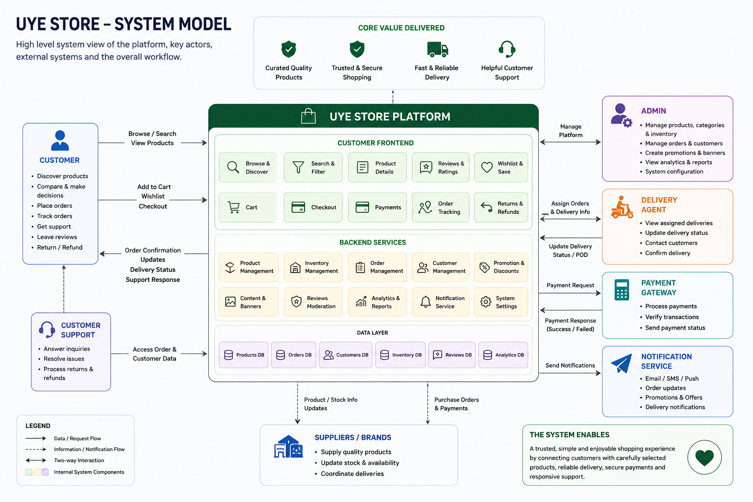
Primary actor
Customer
Supporting actors
- UYE Admin
- Customer Support
- Delivery Agent
- Inventory/Admin
- Payment Provider
The system model helped identify that UYE isn't simply a customer-facing website.
It is an ecosystem connecting customers, products, operations, payments, support and delivery.
Feature Prioritization
I translated research findings into a feature matrix and prioritized features according to user value and implementation complexity.
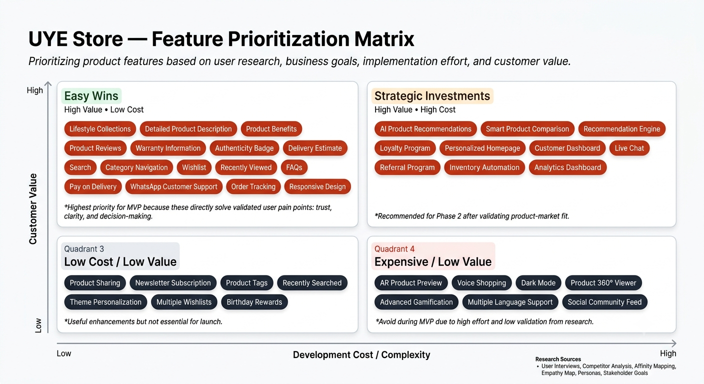
Easy Wins
- Lifestyle collections
- Search
- Categories
- Filters
- Detailed descriptions
- Product benefits
- Specifications
- Reviews
- Warranty
- Authenticity information
- Delivery estimates
- Pay on Delivery
- Wishlist
- FAQs
- WhatsApp support
- Order tracking
Strategic Investments
- Product comparison
- Recommendation engine
- Personalization
- Loyalty
- Referral system
- Advanced analytics
Deferred
- AR
- Voice shopping
- Gamification
- 360° product viewer
- Social community
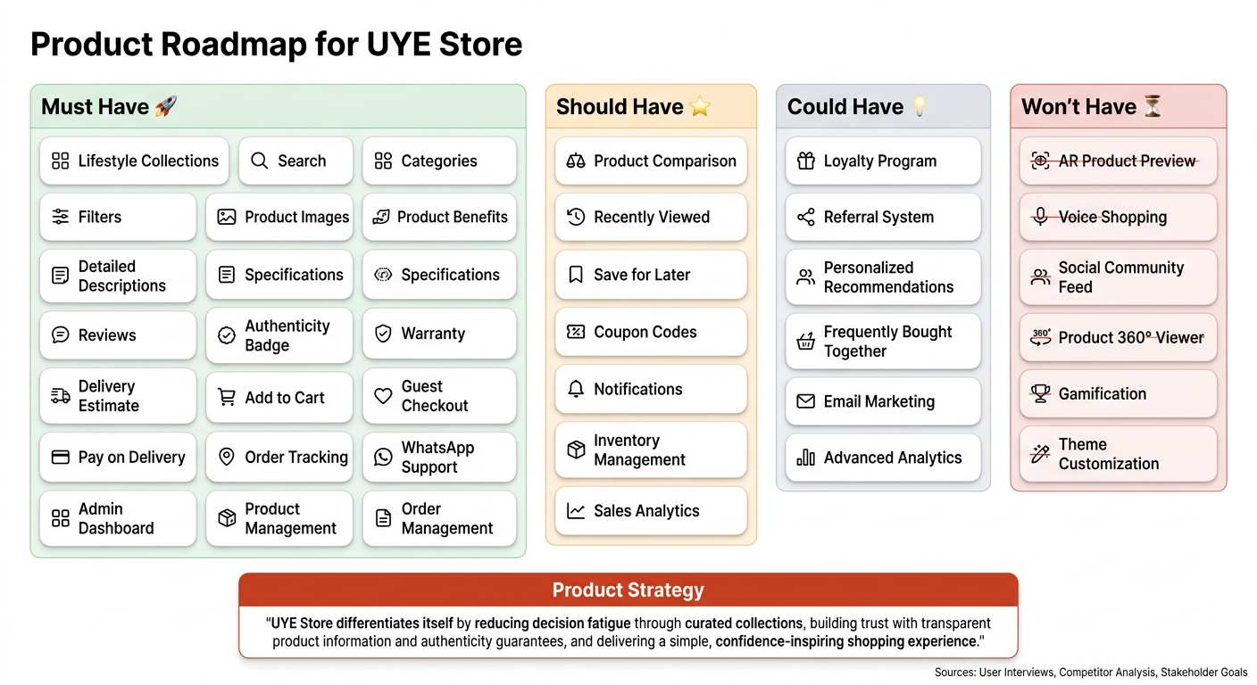
The important decision here was:
Don't build features simply because competitors have them. Build features because they solve a validated user problem or support a clear business objective.
Information Architecture
The research influenced the architecture directly.
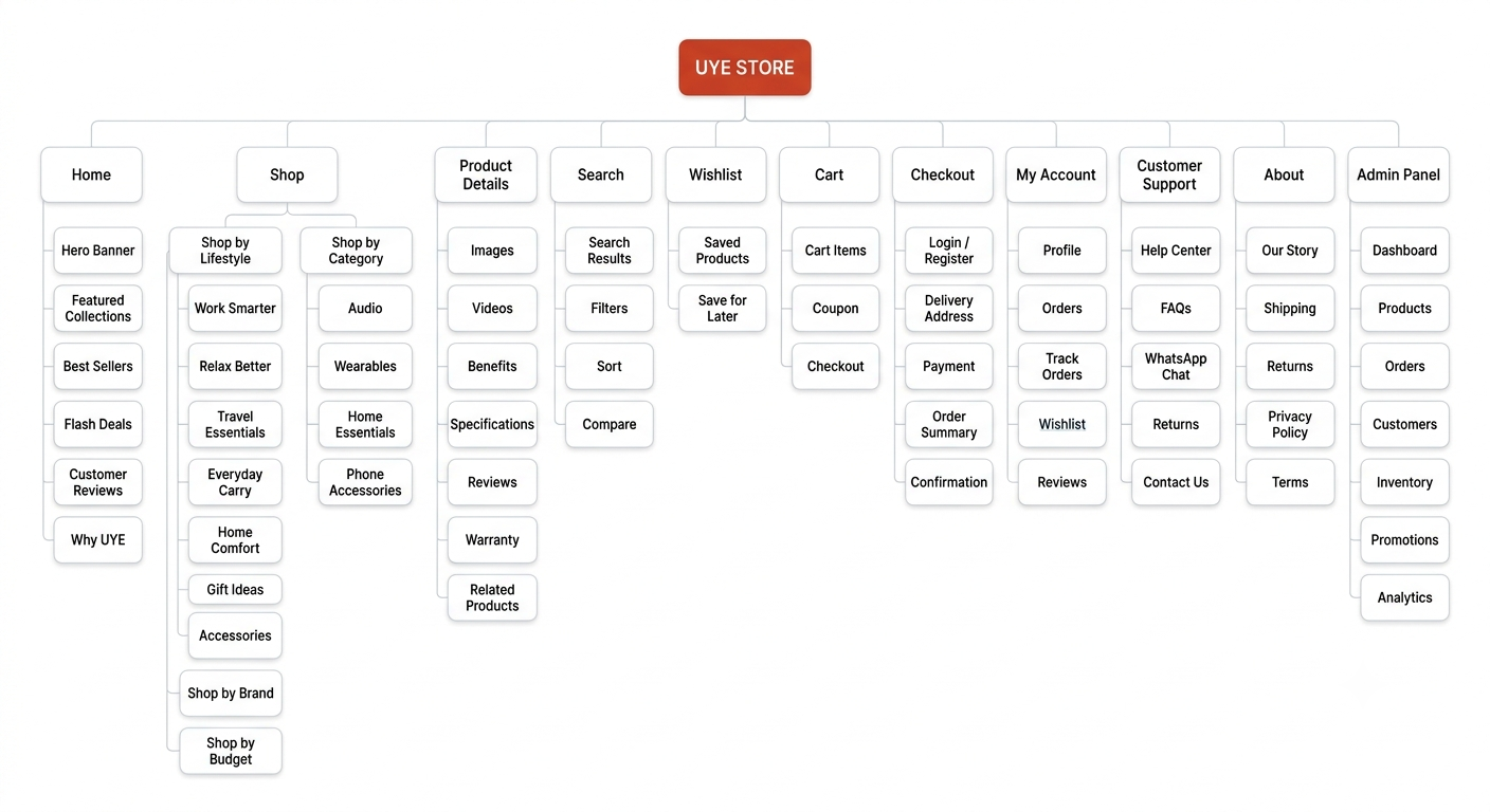
Instead of forcing customers to navigate through endless technical categories, UYE introduces lifestyle-oriented discovery.
Primary structure
UYE STORE
│
├── Home
├── Shop
│ ├── Lifestyle Collections
│ ├── Categories
│ ├── Brands
│ └── Budget
│
├── Search
├── Product Details
├── Wishlist
├── Cart
├── Checkout
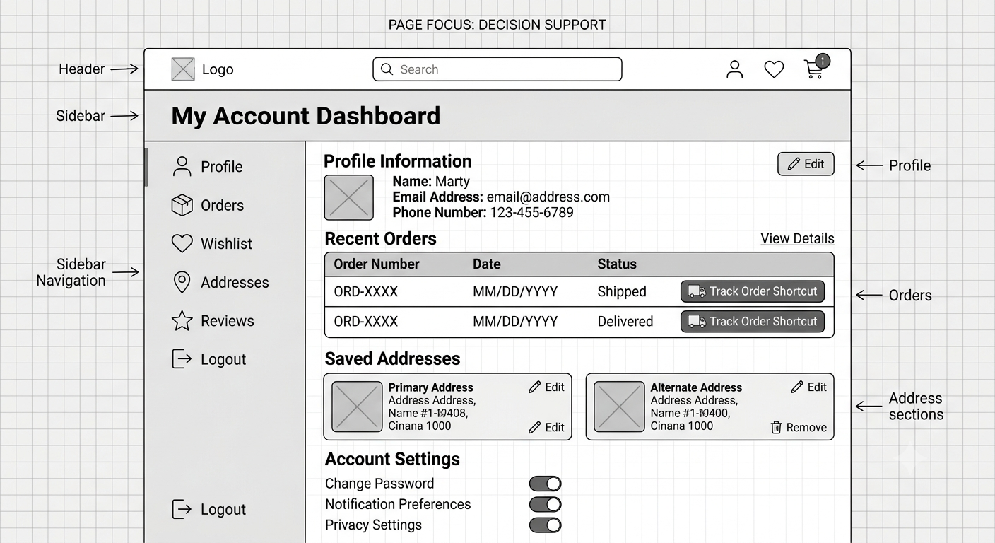
├── My Account
├── Customer Support
└── About UYE
The architecture was designed around the user's mental model rather than the company's internal inventory structure.
User Flow
The primary purchase flow became:
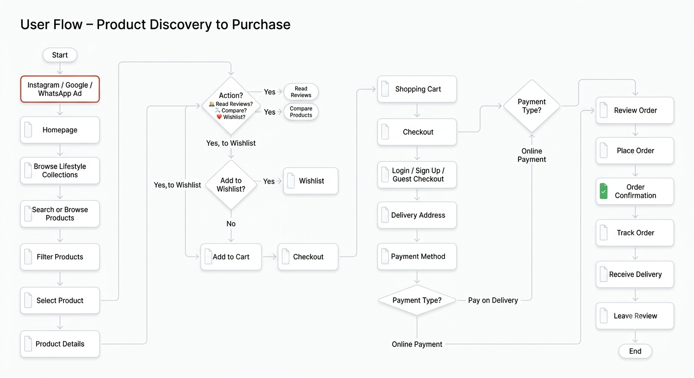
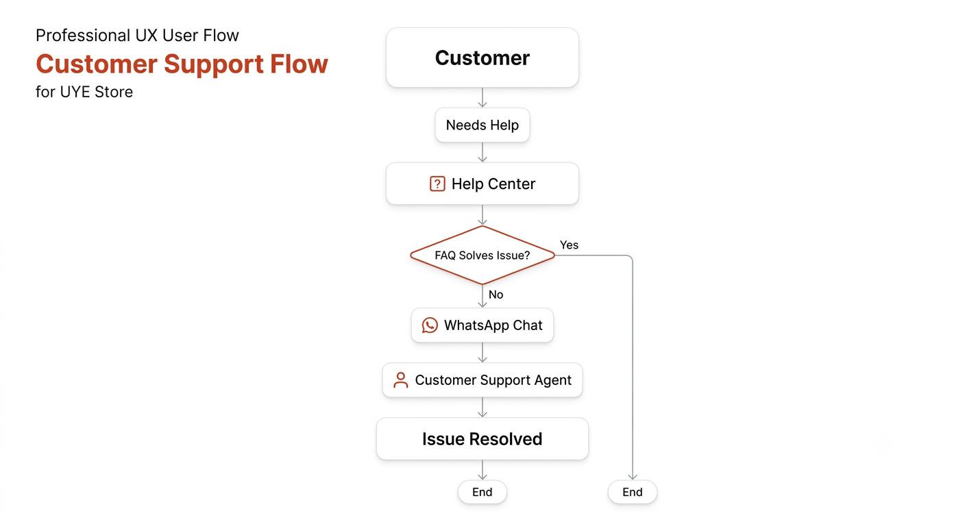
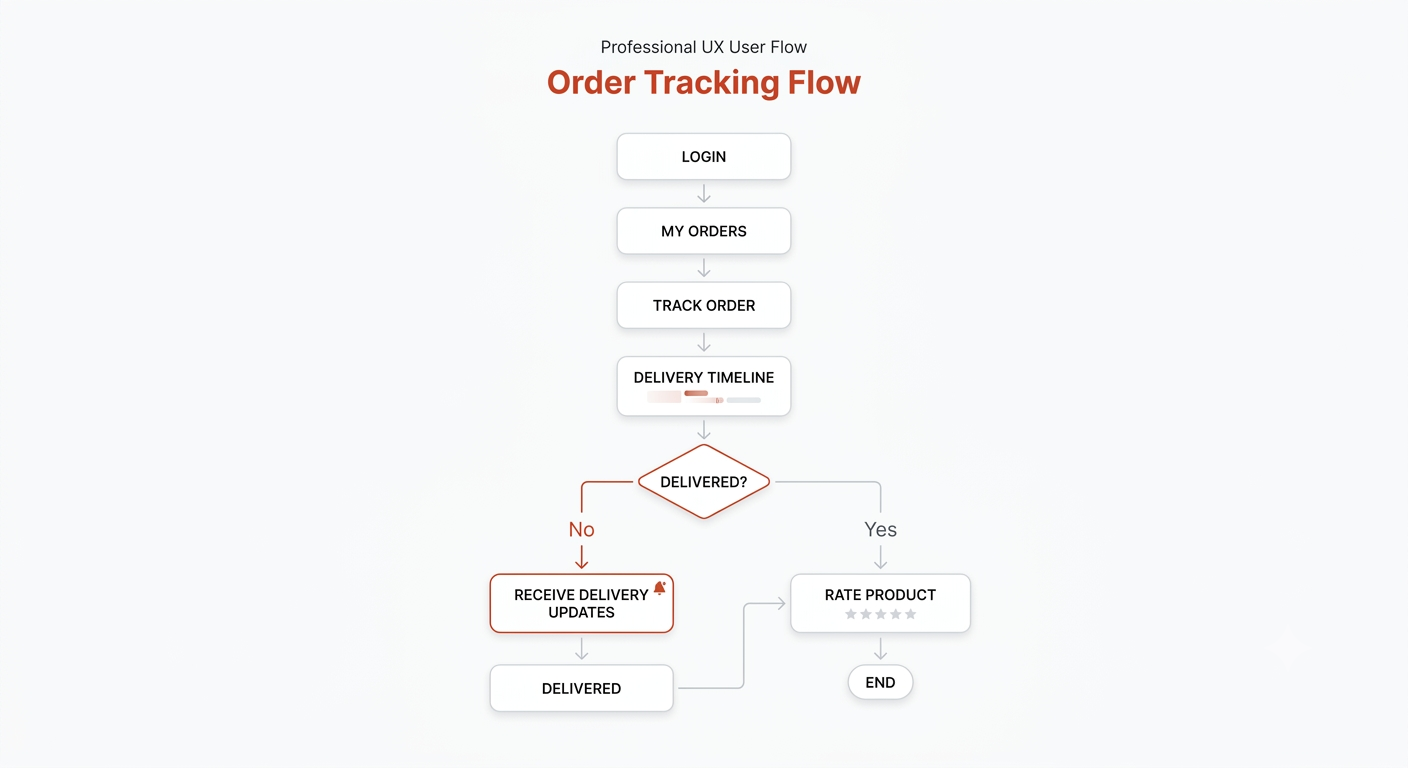
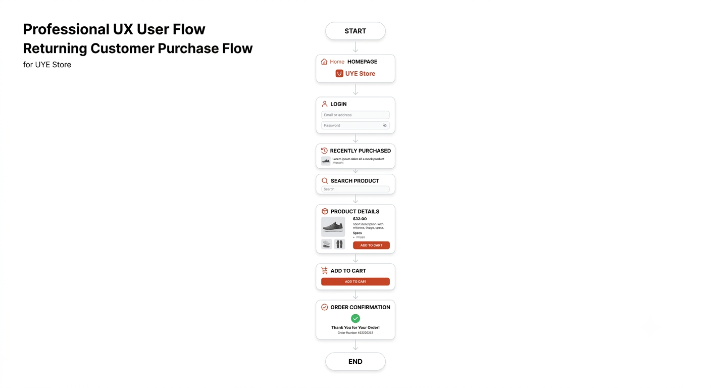
Social Media / Search
↓
UYE Landing
↓
Lifestyle Collection
↓
Product Listing
↓
Product Details
↓
Evaluate
┌──────┼────────┐
Reviews Specs Warranty
└──────┼────────┘
↓
Add to Cart
↓
Cart
↓
Checkout
↓
Address + Payment
↓
Pay on Delivery /
Online Payment
↓
Order Confirmation
↓
Order Tracking
↓
Delivery
This became the backbone of the prototype.
Hierarchical Task Model
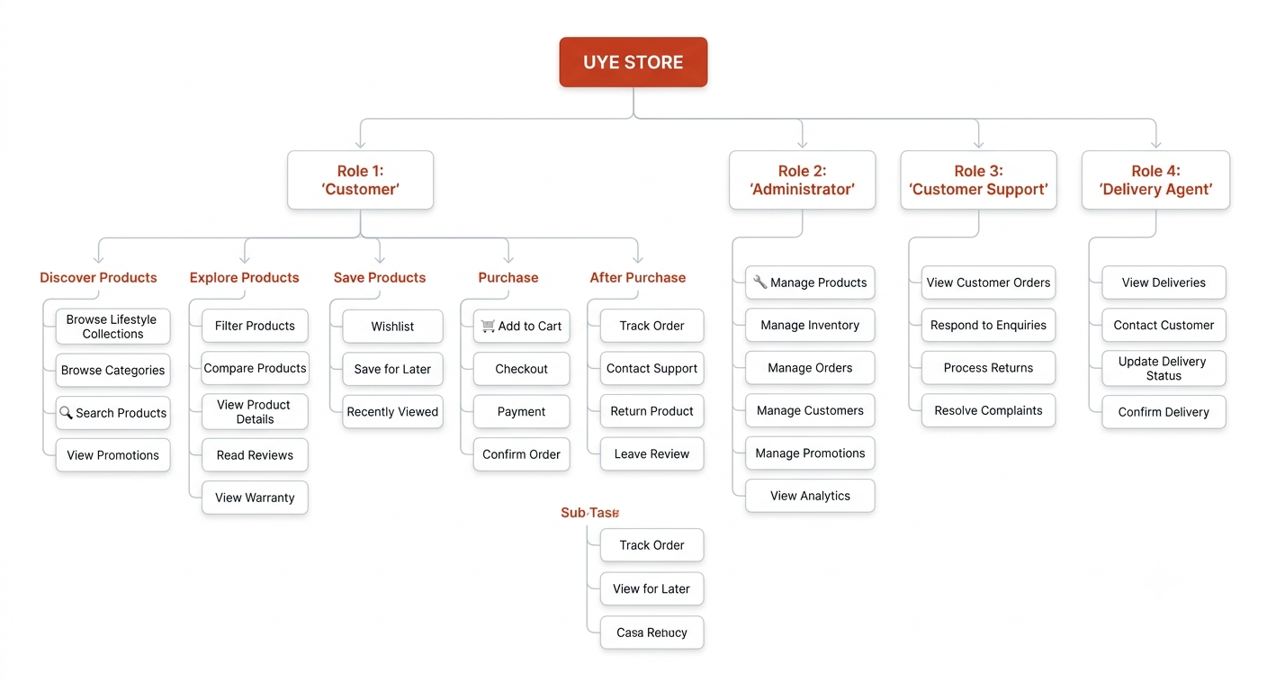
The primary customer task was broken down into:
1. Discover
- Open UYE
- Search/browse
- Select lifestyle collection
2. Evaluate
- View product
- Understand benefits
- Check specifications
- Read reviews
- Check authenticity
- Check warranty
- Check delivery
3. Purchase
- Add to cart
- Review order
- Enter address
- Select payment
- Confirm order
4. Receive
- Track order
- Receive notifications
- Receive delivery
- Contact support if necessary
5. Re-engage
- Review product
- Return
- Reorder
- Continue shopping
User Scenarios
I created scenarios to test how the product could behave in realistic situations.
Scenario 1 — The Overwhelmed Shopper
Thomas needs gadgets before travelling.
He discovers UYE through Instagram.
Instead of landing on a page filled with promotional banners and unrelated products, UYE guides him toward:
Travel Essentials → Recommended Products → Product Information → Purchase
The experience reduces the amount of searching he needs to do.
Scenario 2 — The Gift Buyer
Linda needs a birthday gift for her father.
She searches for men's products and discovers:
Gift Ideas → Men's Gifts → Watches
She evaluates:
- reviews
- specifications
- price
- warranty
and completes the purchase.
The important interaction isn't simply finding the watch.
It is confidence in the decision.
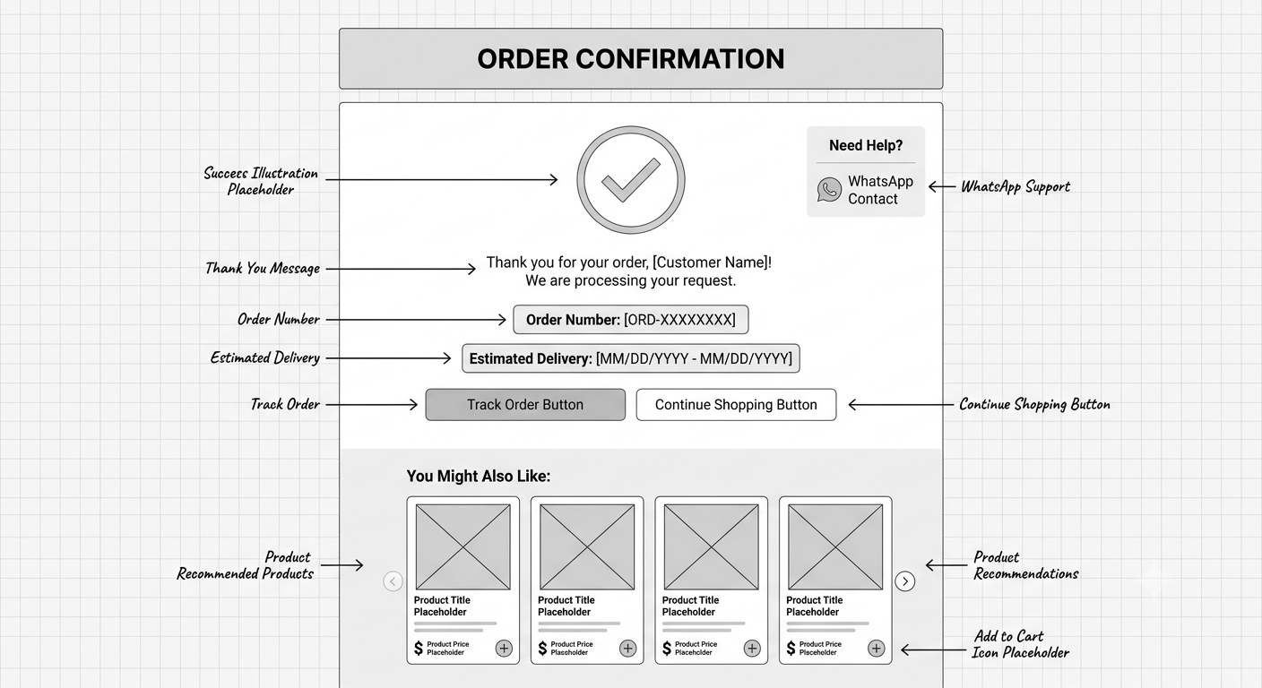
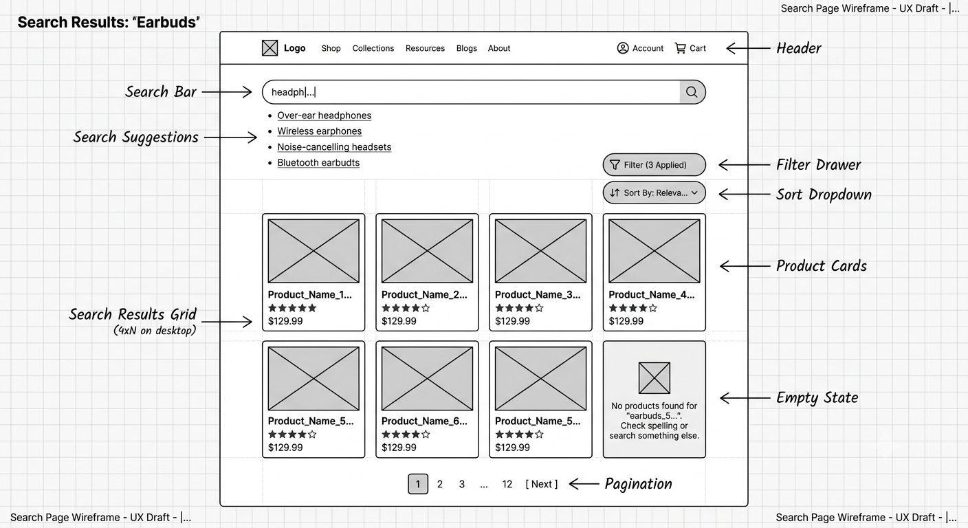
Wireframing
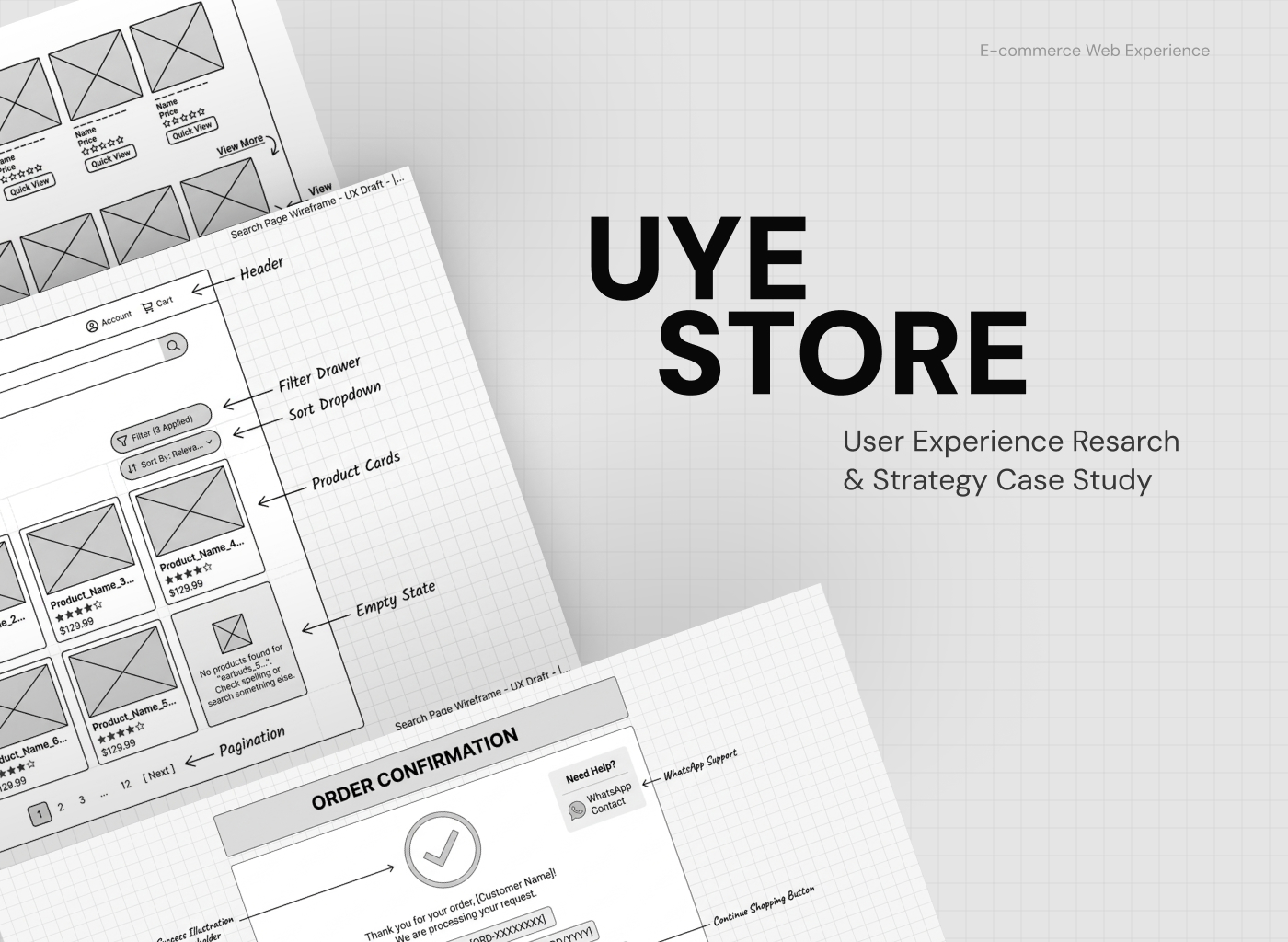
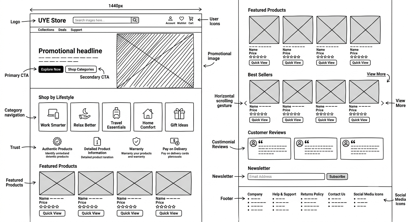
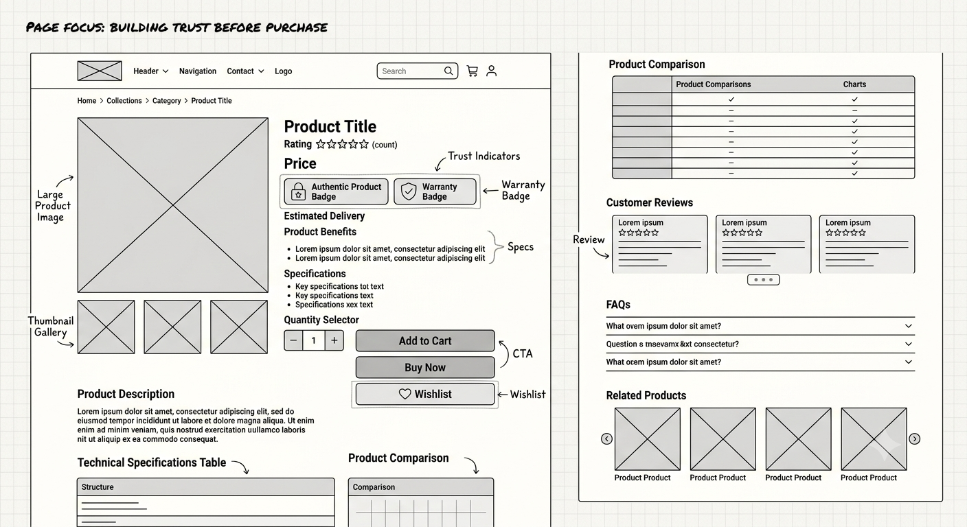
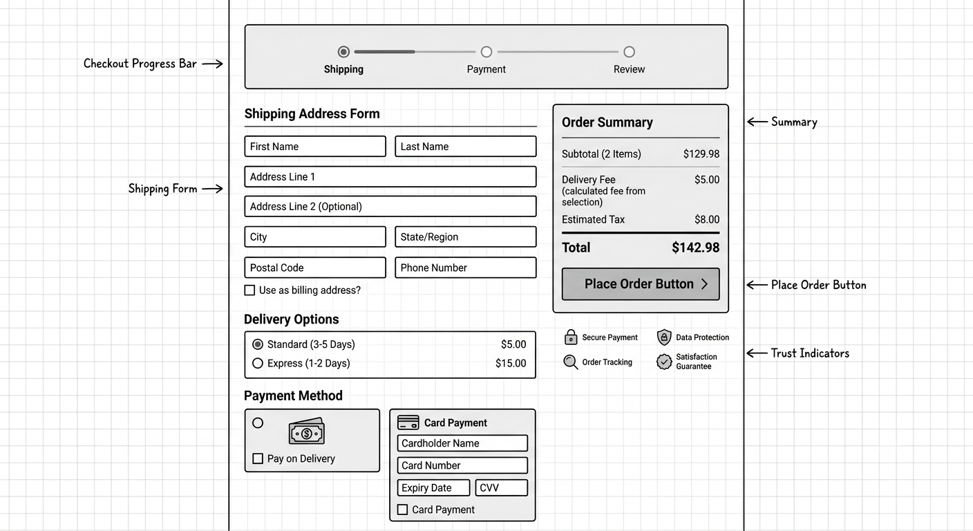
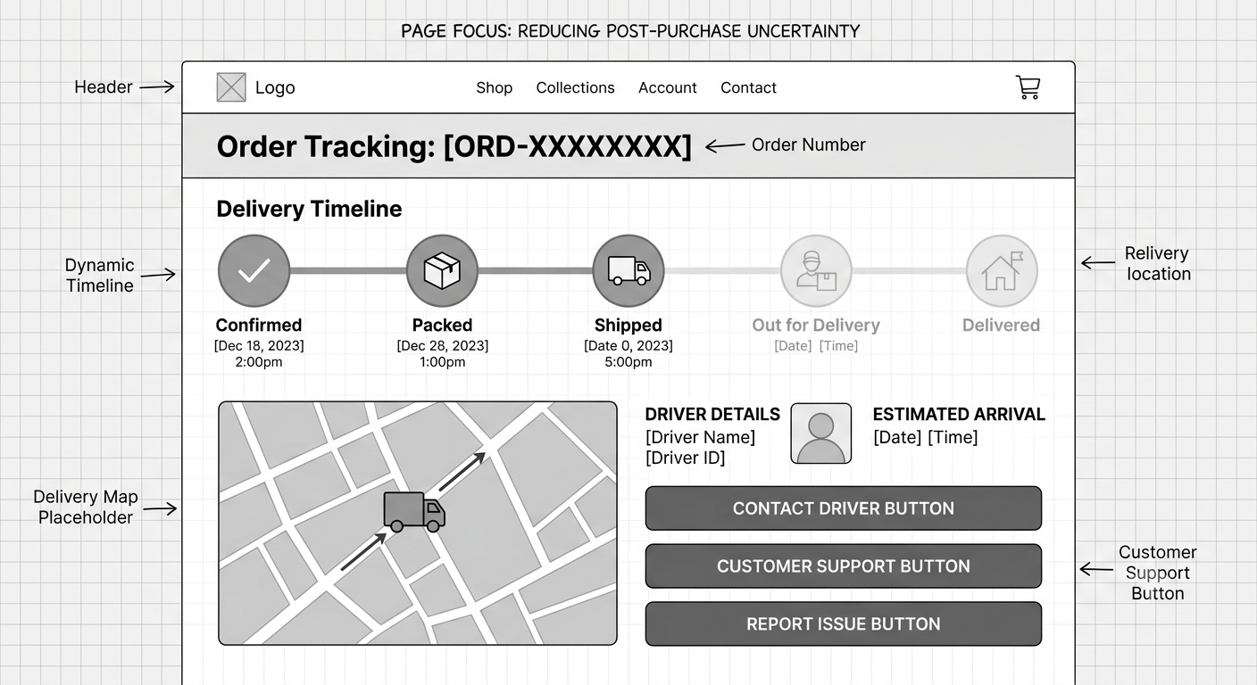
I translated the architecture and flows into low-fidelity wireframes.
The wireframes focused on:
Homepage
- Lifestyle discovery
- USP
- Trust signals
- Featured products
- Reviews
Collection
- Lifestyle filtering
- Product cards
- Search
- Sorting
- Filters

Product Detail
- Product imagery
- Benefits
- Specifications
- Reviews
- Warranty
- Authenticity
- Delivery information
- CTA
Cart
- Products
- Quantity
- Delivery
- Total
- Checkout

Checkout
- Address
- Delivery
- Payment
- Pay on Delivery
- Order summary
Post-purchase
- Confirmation
- Tracking
- Support
Prototype Strategy
The prototype is designed around the critical customer journey, rather than attempting to prototype every possible interaction.
Primary prototype
Discover → Evaluate → Purchase → Track
This allows usability testing around the most important business question:
Can users confidently find and purchase a product without feeling overwhelmed or uncertain?
Key Interactions to Prototype
The prototype includes interactions such as:
Search
Search → suggestions → results
Filters
Filter → select → update results
Product Gallery
Thumbnail → change primary image
Product Information
Accordion → expand/collapse specifications
Reviews
CTA → reviews section
Warranty
Badge → information overlay
Authenticity
Badge → trust explanation tooltip
Wishlist
Heart → saved state
Cart
Add → confirmation toast → cart update
Checkout
Address → payment → confirmation
Payment
Pay on Delivery / Online Payment
Order
Place order → success → tracking
Tracking
Status → delivery progress
Support
Help → WhatsApp/support
The Design Decision
The biggest design decision from this project was:
UYE should not try to win by giving users more choices. It should win by helping users make better choices.
Expected Product Impact
Because the product has not launched, I would not claim actual conversion or revenue results.
Instead, I would define the success metrics that should be measured after implementation.
Business metrics
- Conversion rate
- Repeat purchase rate
- Average order value
- Cart abandonment
- Product-page-to-cart conversion
UX metrics
- Product discovery success rate
- Time to find a suitable product
- Checkout completion
- Search success rate
- Task completion rate
- Support requests
- User confidence rating
Trust metrics
- Pay on Delivery usage
- Return rate
- Product review rate
- Product-page engagement
What I Learned
01. More choice doesn't always mean more value.
A large catalogue can be useful, but when products become difficult to distinguish, more options can create friction.
02. Trust is part of the product experience.
Trust isn't just branding.
It appears in:
reviews + information + warranty + payment + delivery + support.
03. Research changes the problem.
I initially approached the project as an e-commerce design problem.
The research revealed a more interesting problem:
How do we help people confidently decide what to buy?
04. UX decisions should connect to business goals.
Every major feature was evaluated against:
User need + business value + implementation effort.
Final UX Solution
The proposed UYE experience is built around four principles:
UYE
│
┌────────────┼────────────┐
↓ ↓ ↓
DISCOVER TRUST DECIDE
│ │ │
Curated Reviews Clear
Collections Warranty Benefits
Search Authenticity Specs
Categories POD Comparison
│ │ │
└────────────┼────────────┘
↓
PURCHASE
↓
RETAIN
The experience helps users move from:
"I need something."
to
"I know what I want."
to
"I trust this store."
to
"I'm confident buying it."
Let’s talk about a project together
Websites
Branding
Logo
Copywriting
Webflow
Wordpress
Strategy
UI/UX
Visuals
Elementor
E-commerce
SaaS
Healthcare


I help entrepreneurs and coaches dominate their markets through premium positioning, bold strategy, and modern design that converts.
Get in touch
© 2026 Freeman James. All rights reserved.